Create Stunning Data Visualizations in 1 Click
Graphs Generated by AI Graph Maker
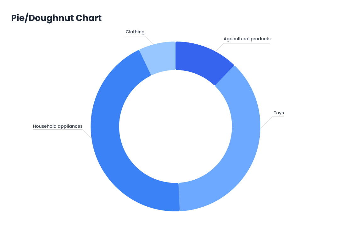
Pie Chart
A pie chart is a circular statistical graph that displays the proportion of each part in relation to the whole, which is commonly used in market analysis, financial reports, demographic studies, resource allocation, project progress tracking, and more.
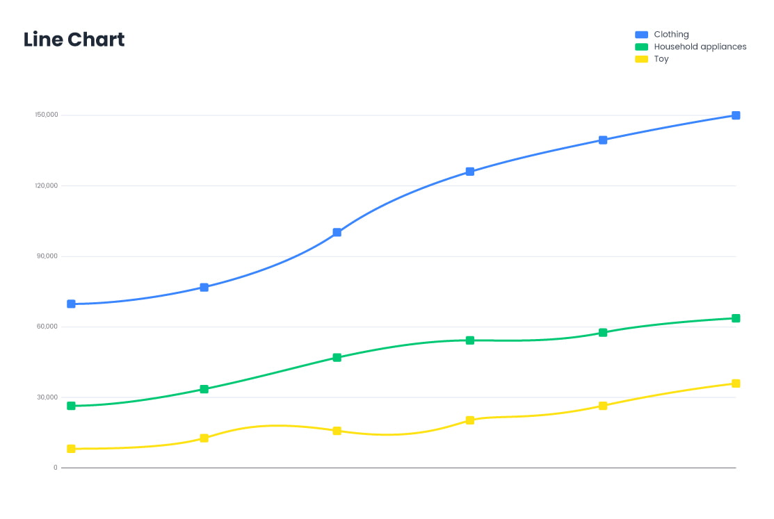
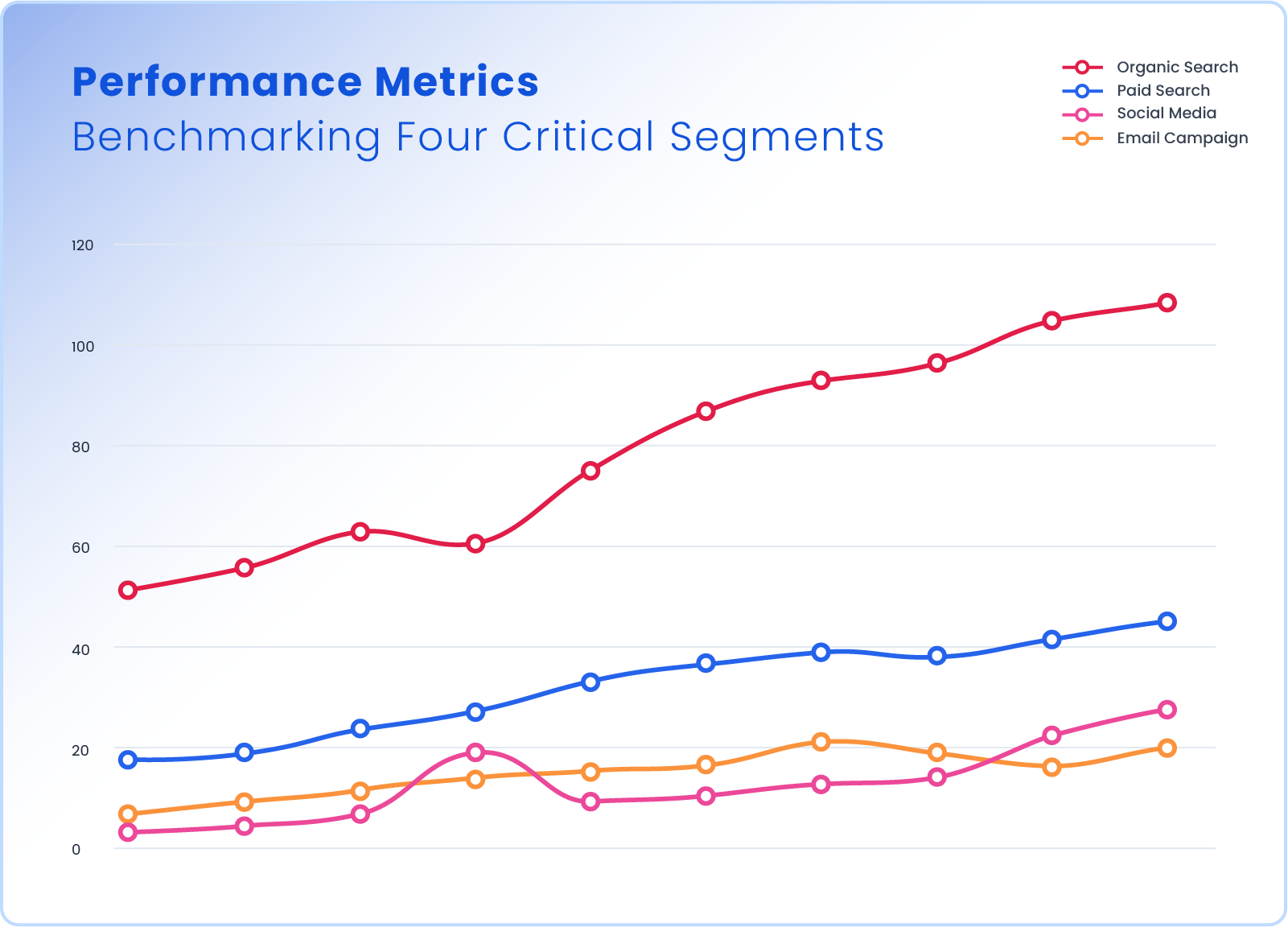
Line Chart/Racing Line Chart
AI Graph Maker allows users to quickly understand data fluctuations and trends through clear, simple visualizations, enabling more informed and effective decision-making. Thanks to its intelligent chart generation capabilities, AI Graph Maker helps users efficiently create accurate line charts, streamlining data analysis and enhancing decision-making processes.

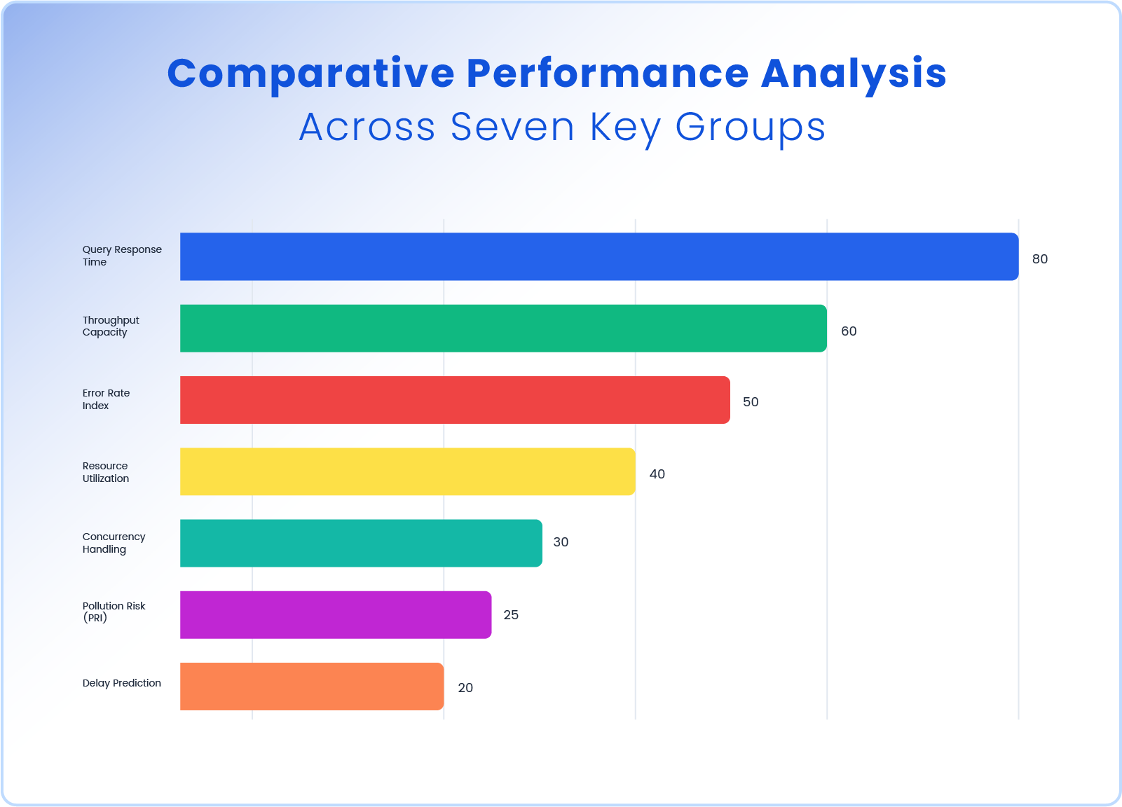
Bar Chart/Racing Bar Chart
With the AI Graph Maker, bar charts are generated by visualizing data using the length or height of rectangular bars, making it easy to compare data across different categories or time periods. This tool is especially ideal for displaying discrete data, categorical data, and time-series data, enabling clear comparisons between different datasets.

Sunburst
A Sunburst chart is a multi-level, radial visualization used to represent hierarchical data. It displays data as a series of concentric rings (or “arcs”), where: The center circle represents the root level. Each level outward shows deeper layers in the hierarchy. The angle of each segment represents its proportional size relative to its siblings. It’s visually similar to a pie chart but with nested, hierarchical layers.
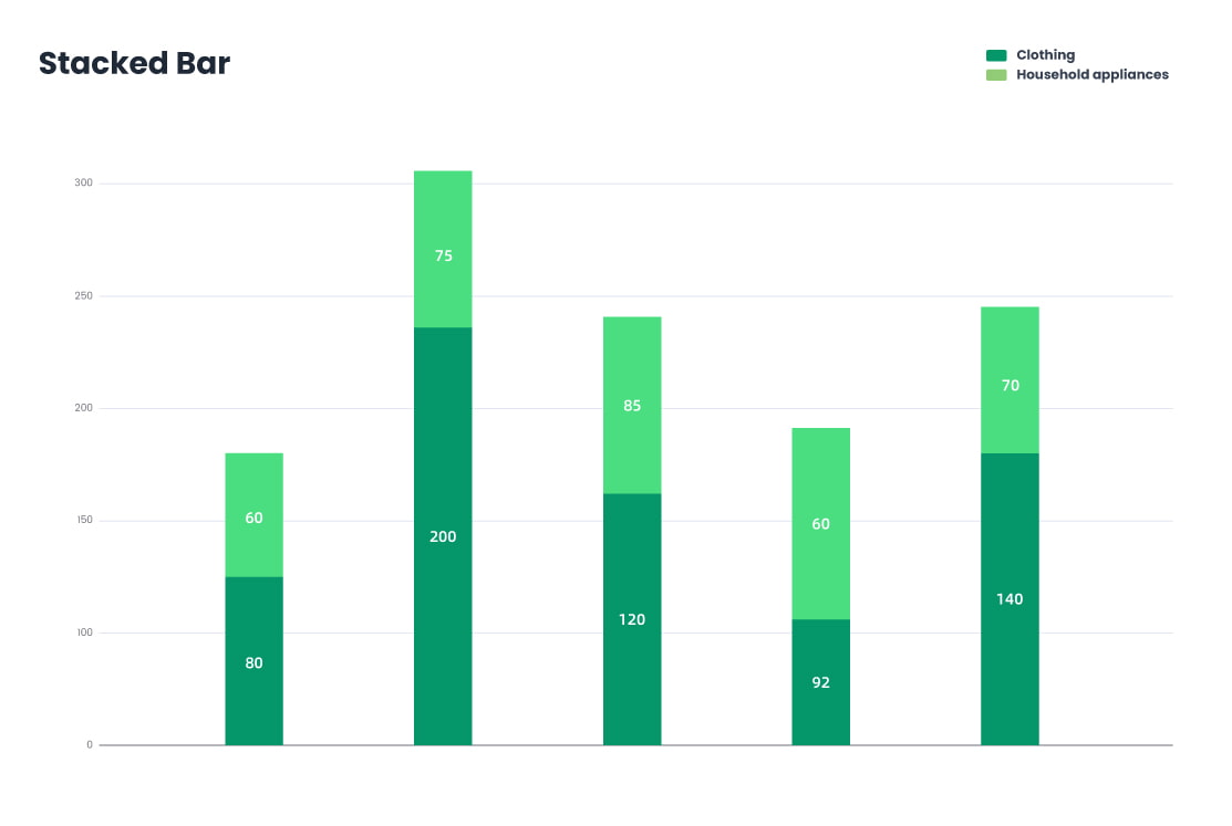
Stacked Bar
A Stacked Bar Chart is a type of bar chart that displays multiple data series stacked on top of each other (in vertical bars) or side by side, making it ideal for comparing parts of a whole across categories. it can be used in finance, marketing, education and etc.
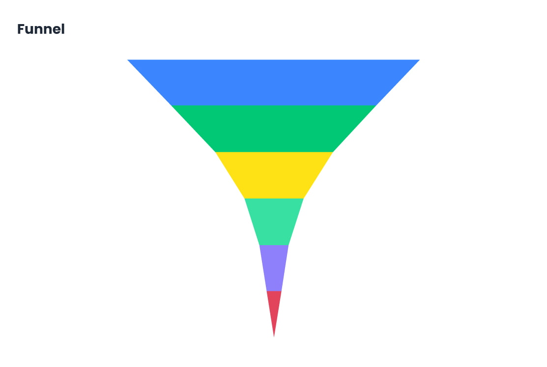
Funnel
A funnel chart is a visual representation of a process with multiple sequential stages, where the data typically decreases at each stage. It resembles a funnel shape, with the widest section at the top (representing the initial volume) and narrower sections below showing drop-off at each subsequent stage. It’s mainly used to identify bottlenecks, analyze conversion rates, or visualize how data progresses through steps.
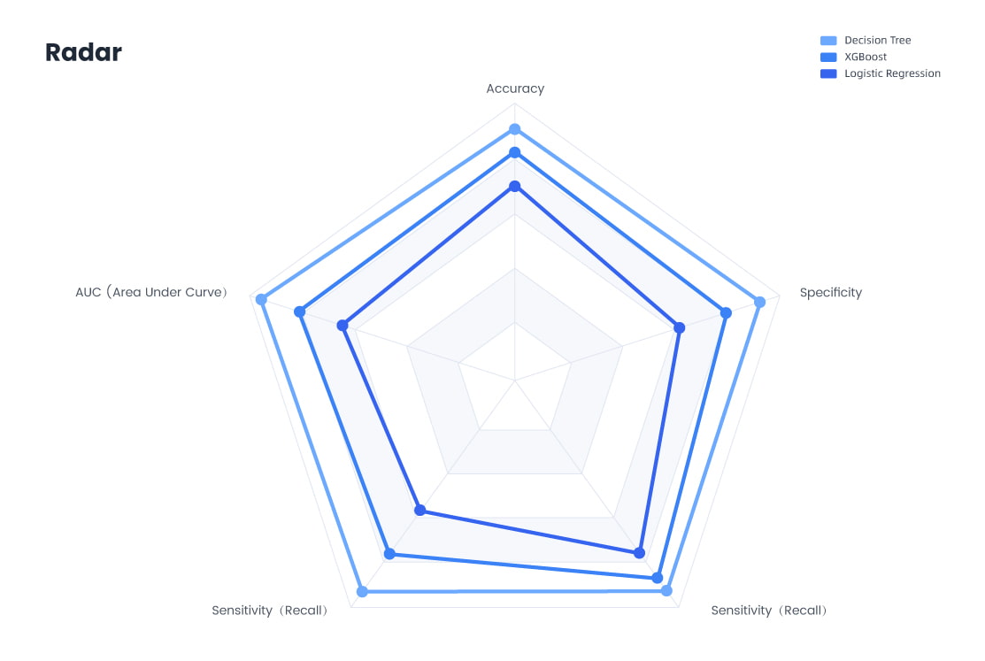
Radar
A Radar Chart (also called a Spider Chart or Web Chart) is used to display multivariate data in a two-dimensional chart with three or more quantitative variables plotted on axes starting from the same central point. It’s excellent for comparing multiple entities across the same set of features or categories.
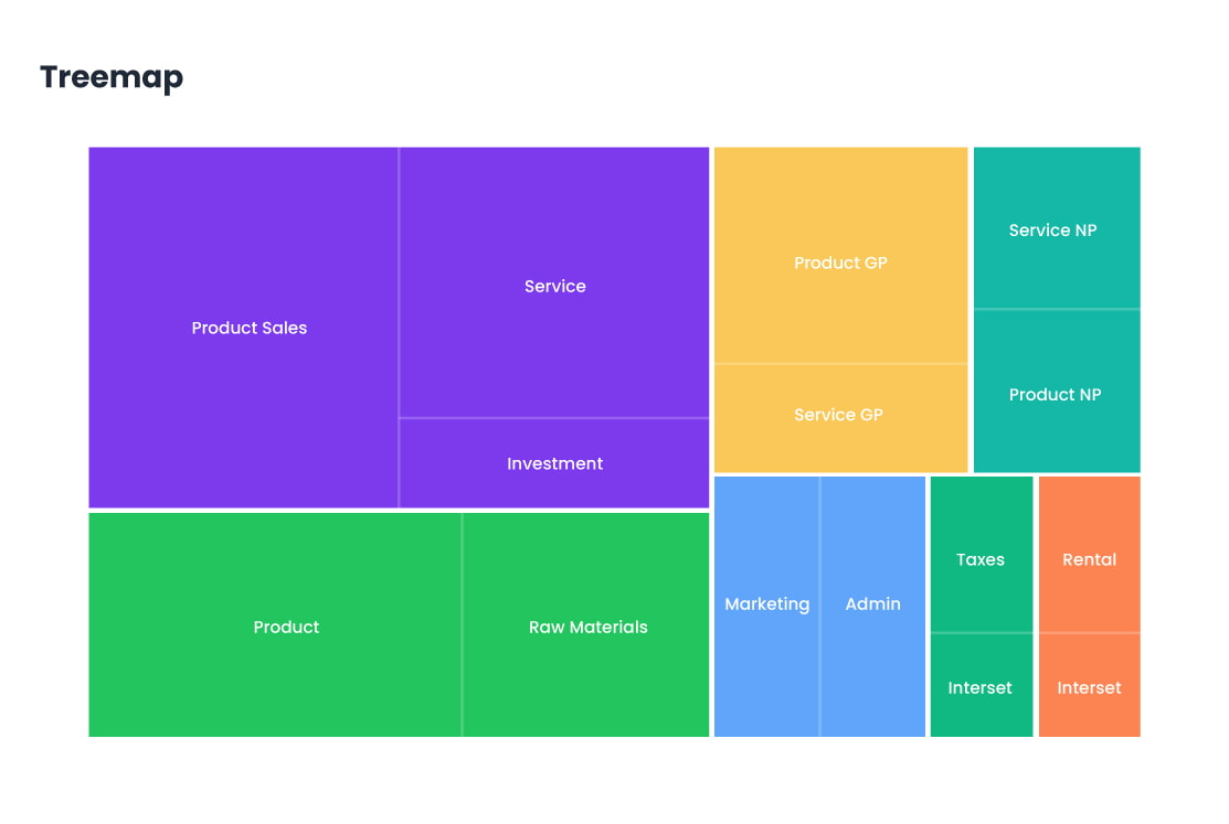
Treemap
A Treemap displays hierarchical data as nested rectangles, where the size and color of each rectangle represent quantitative values. Larger areas indicate larger values, and nesting shows category relationships. Commonly used for visualizing file system storage, company revenues by product line, stock market sectors, budget breakdowns, and website analytics (e.g., pageviews per section). It's ideal for spotting patterns, proportions, and outliers in dense datasets.
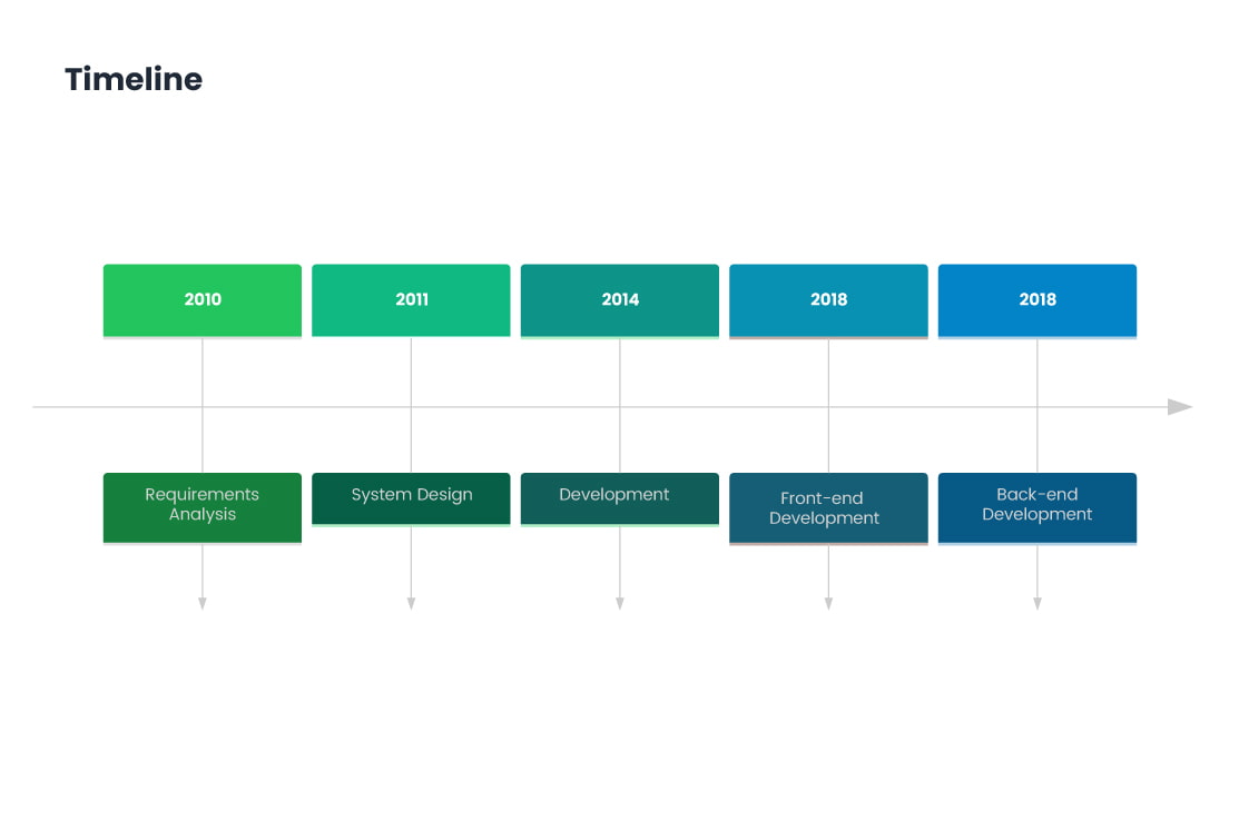
Timeline
With the AI Graph Maker, generate timelines that display events or tasks in chronological order, providing users with a clear view of their schedule. Whether it's for project management, personal planning, historical tracking, or event planning, the AI Graph Maker's timeline feature offers a powerful and intuitive tool for time management. It helps users efficiently plan and control task progress, ensuring that everything is completed on time and improving overall productivity.
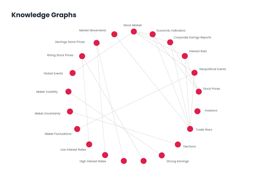
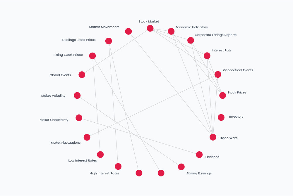
Knowledge Graphs
A Knowledge Graph represents information as a network of entities (nodes) and their relationships (edges). It structures data semantically, enabling machines to understand context and connections. Used in search engines, recommendation systems, chatbots, biomedical research, and enterprise data integration. They improve information retrieval, reasoning, and discovery by linking related concepts across data sources.

Gantt Chart
Powered by AI technology, the AI Graph Maker automatically creates professional Gantt charts, helping users efficiently plan tasks, track progress, and optimize resource allocation to improve productivity and ensure projects are completed on time.
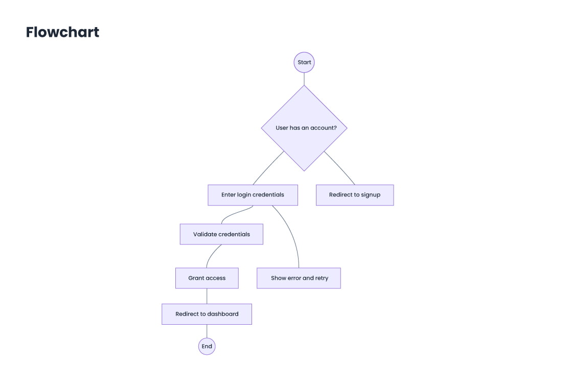
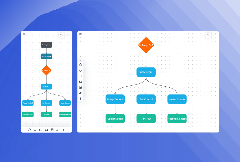
Flowchart
A flowchart uses graphical symbols to represent the steps of a process or task, making complex workflows easier to understand. With AI Graph Maker, you can quickly create clear and effective flowcharts for various applications, including project management, software development, training, and business process mapping.
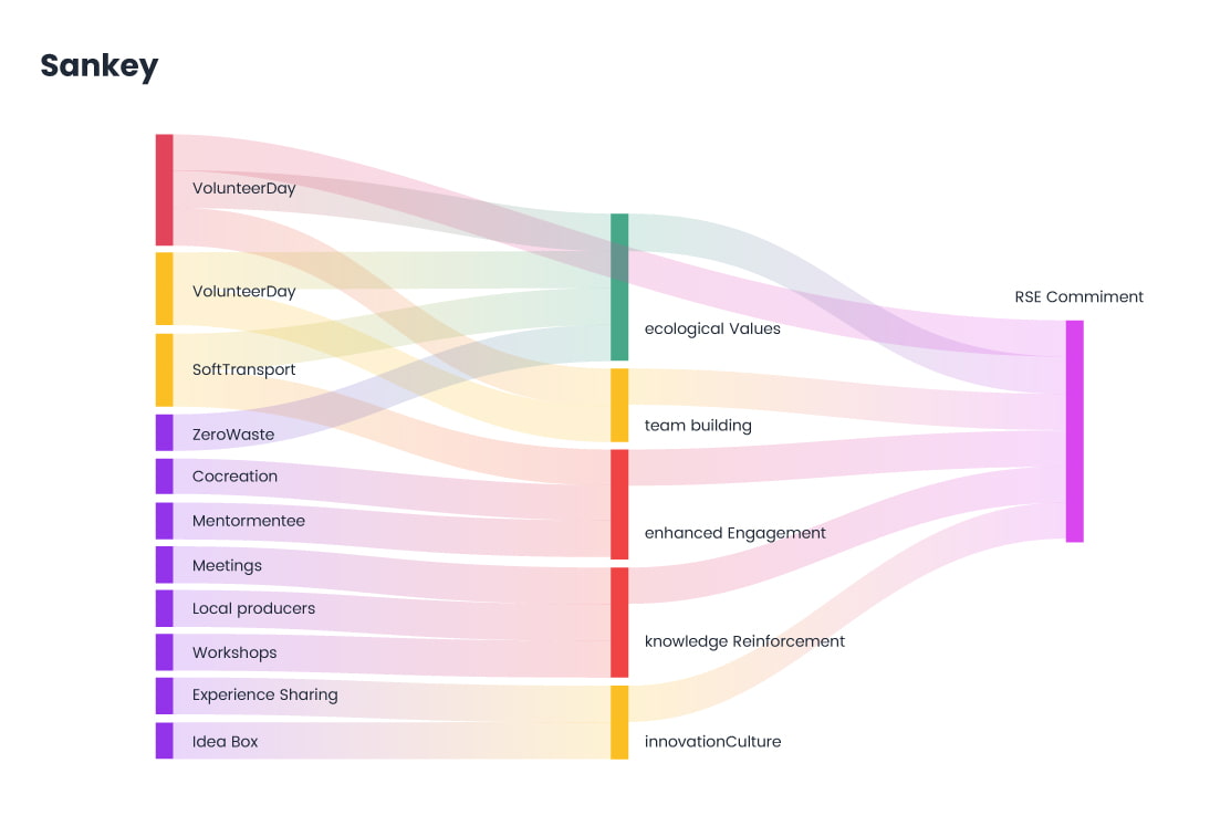
Sankey
A Sankey diagram visualizes flows between stages, where the width of each link represents the magnitude of the flow. It’s ideal for showing how resources, data, or energy split and combine through a system. Common in energy flow analysis, user journey mapping, financial transfers, website click paths, supply chains, and budget breakdowns. It helps identify inefficiencies, major pathways, and flow distribution at a glance.
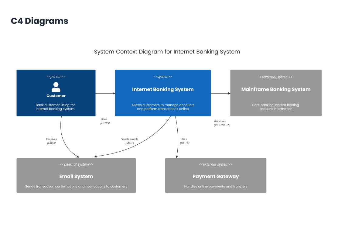
C4 Diagrams
C4 Diagrams are a set of hierarchical diagram types used for visualizing software architecture at various levels of abstraction. They consist of: Context Diagram – High-level overview of the system and external interactions. Container Diagram – Breaks down the system into containers (e.g., web apps, databases). Component Diagram – Details components within a container. Code Diagram – Represents internal code-level structure.
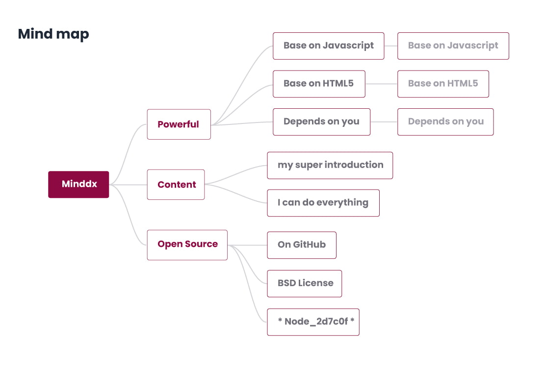
Mind map
The AI Graph Maker generates Mind Maps, which visualize the relationships between a central theme and related subtopics. The Mind Maps are commonly used for personal and team activities such as brainstorming, planning, learning, decision-making, and creative work.
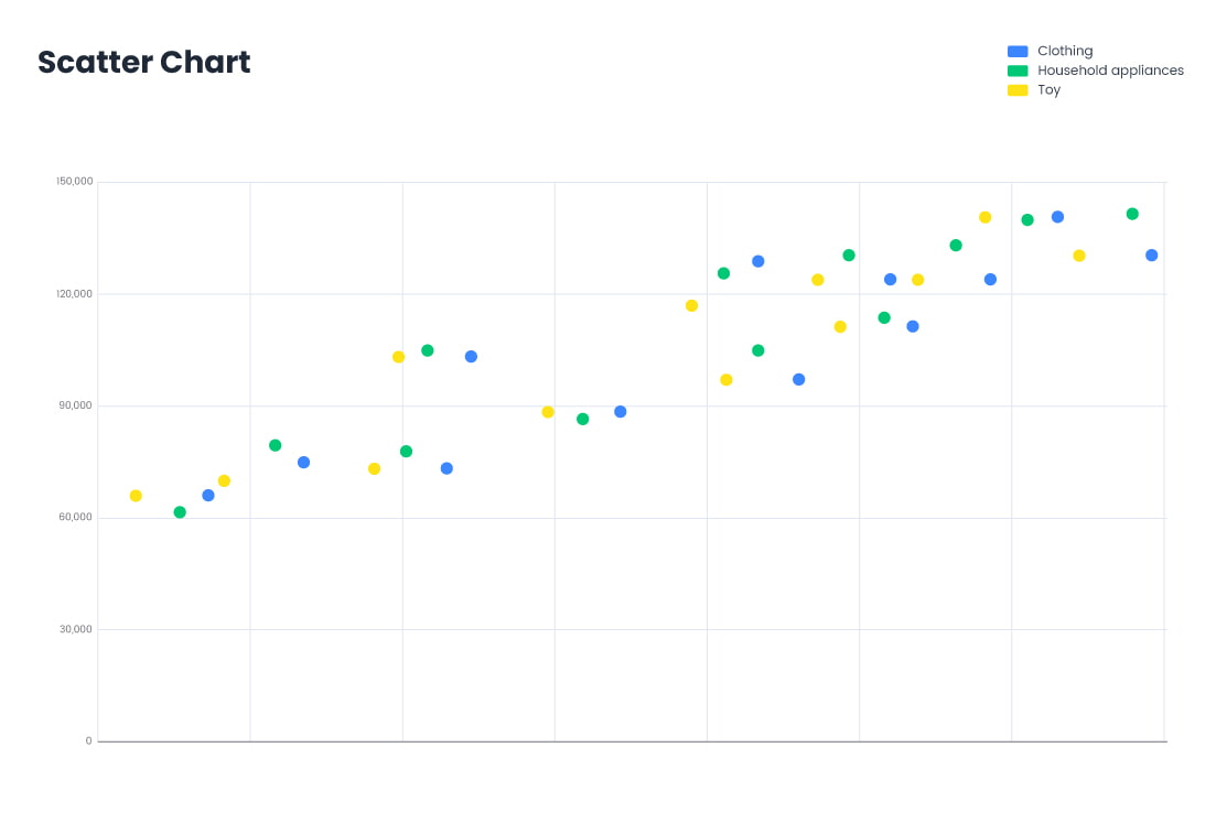
Scatter plot
A Scatter Plot displays data points as dots on a 2D plane, where each axis represents a variable. It’s useful for identifying relationships, trends, or correlations between two variables. Common in statistical analysis, trend analysis, and regression modeling. It’s used in fields like economics (price vs. demand), healthcare (age vs. blood pressure), marketing (ad spend vs. sales), and quality control (product defects vs. production rate).
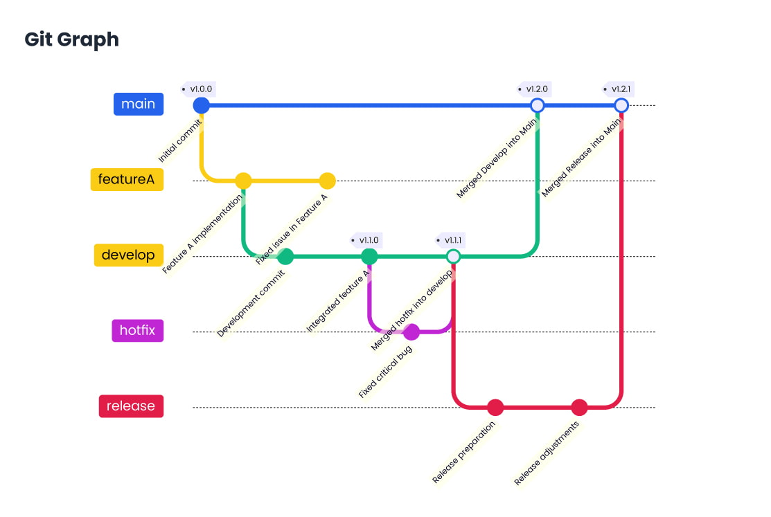
Git Graph
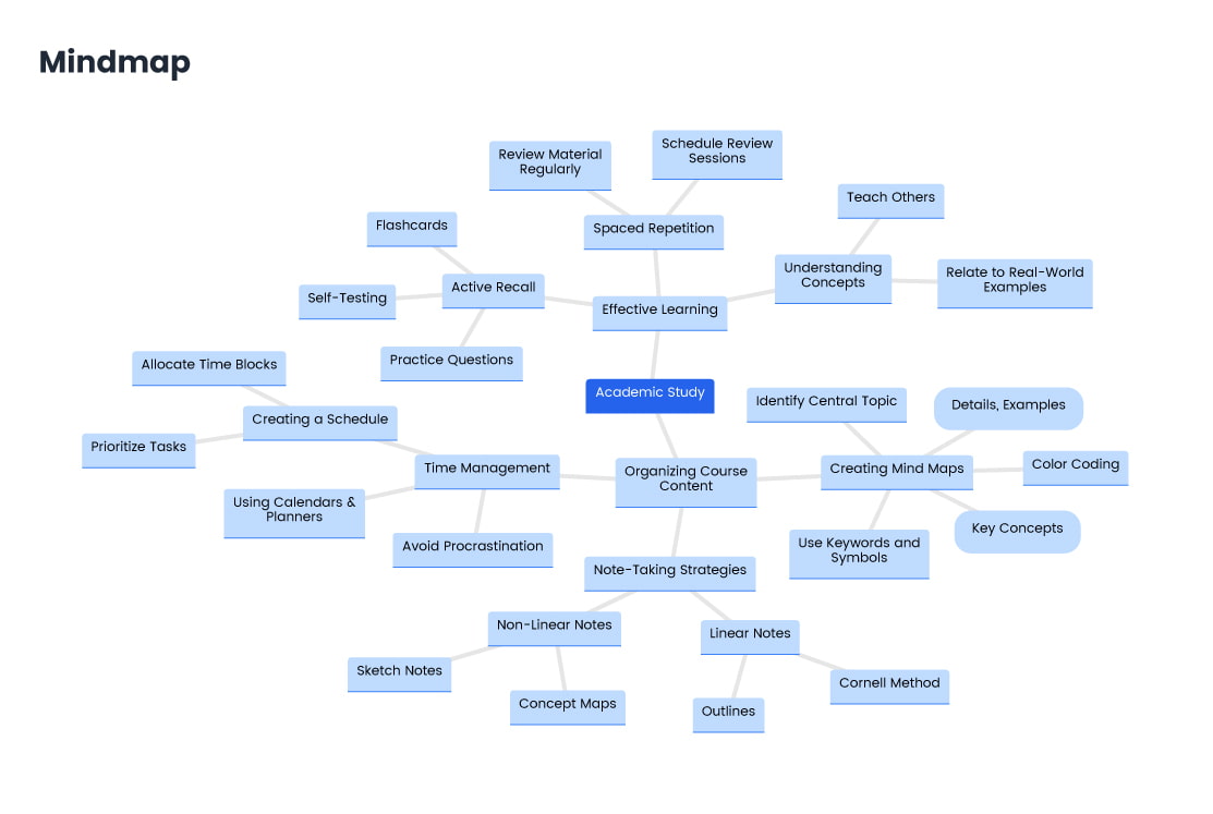
Mindmap
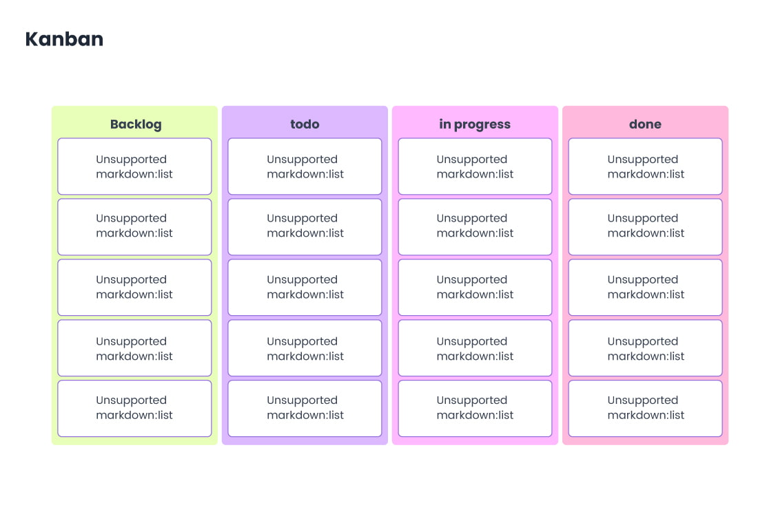
Kanban
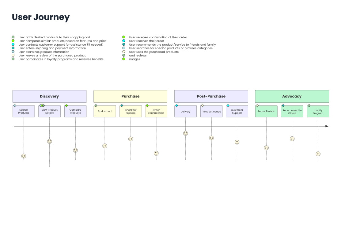
User Journey
New Features Showcase
Time-Evolving Competition Charts
Features of AI Graph Maker

Responsive Design

AI-Generated

Visual Adjustment

Multi-format Export

User-friendly Interface
