Histogram vs Bar Chart-Healthcare Data Analysis
Scenario: A hospital wants to analyze the distribution of patient wait times in the emergency department.
Application: By creating a histogram of wait times, the hospital can identify if there are any peaks or outliers. If the histogram shows a large number of patients with long wait times, it may indicate a need for additional resources or process improvements in the emergency department.
Description
## Data Analysis with Histogram
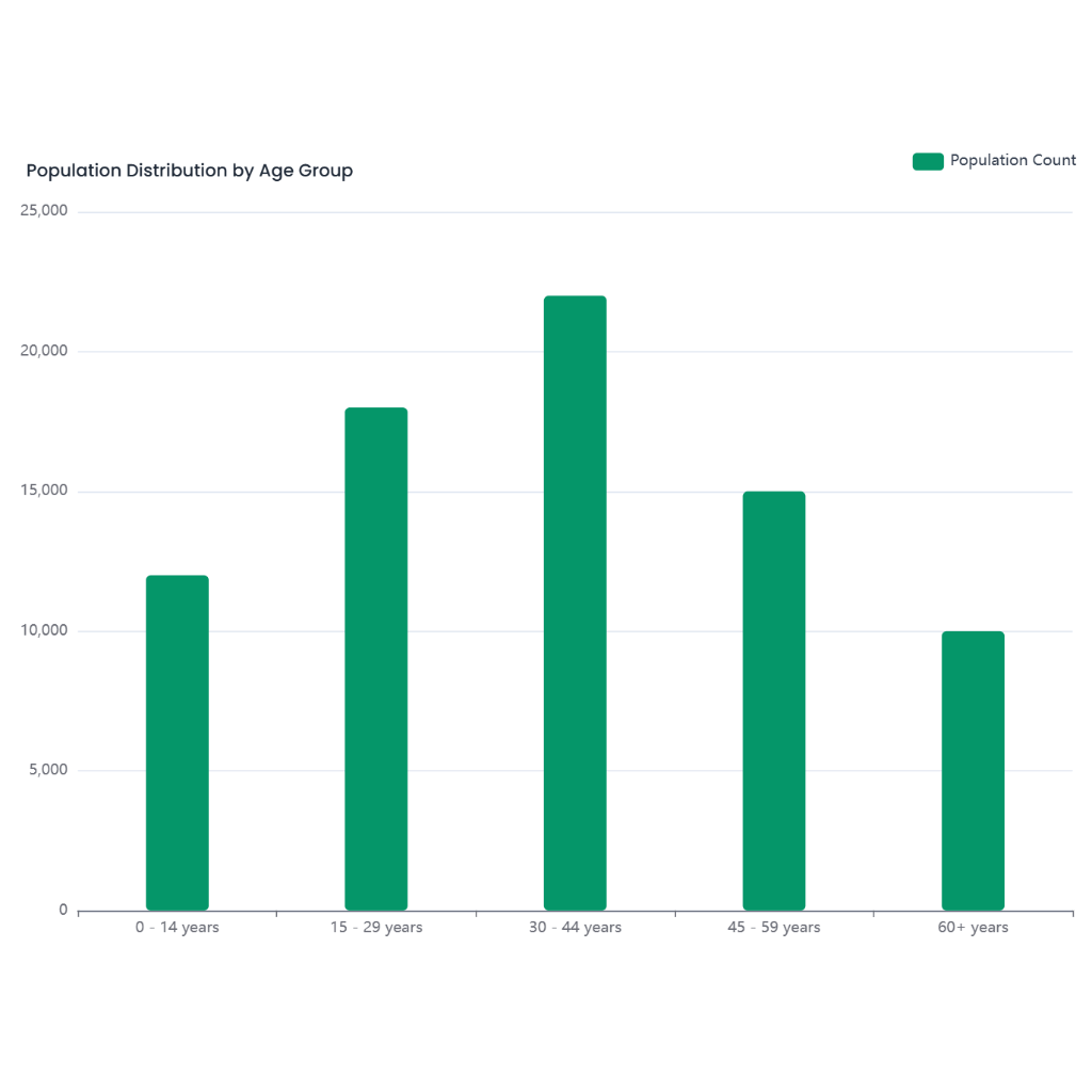
Hospitals can utilize data analysis tools, such as histograms, to visualize and analyze the distribution of patient wait times in the emergency department. A histogram provides a graphical representation of the frequency of different wait time intervals, allowing hospitals to quickly identify patterns and potential issues in patient flow.
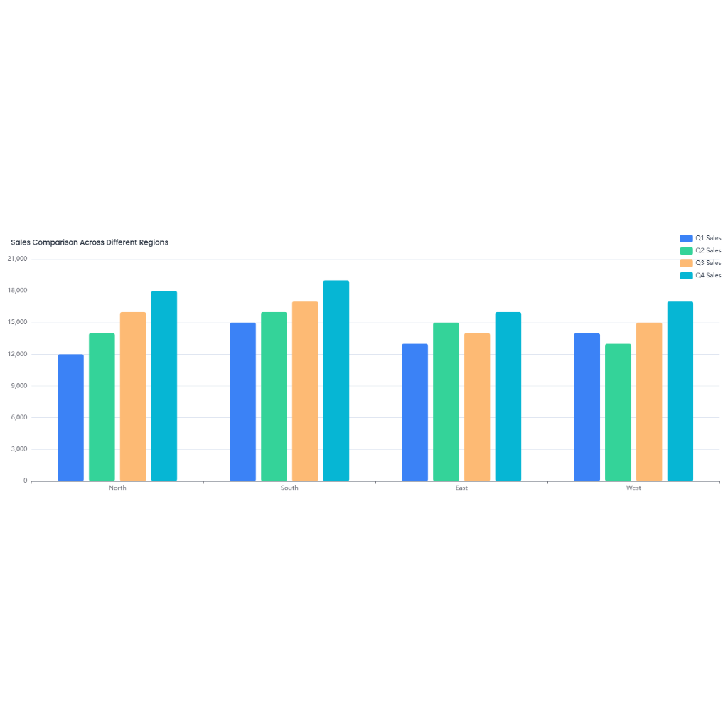
## When to Use a Histogram vs a Bar Chart
A histogram is the preferred choice for displaying the distribution of continuous data, such as patient wait times. Unlike a bar chart, which is used to compare discrete categories, a histogram groups data into intervals (bins) and shows the frequency of data points within each interval. This makes it easier to see the shape of the data distribution and identify any peaks or outliers.
For example, a bar chart might be used to compare the average wait times across different days of the week or different shifts. Each bar would represent a specific category (e.g., Monday, Tuesday, etc.) and the height of the bar would indicate the average wait time for that category.
A histogram, on the other hand, would be used to show the distribution of all wait times across a continuous range. Each bar (or bin) in the histogram represents a range of wait times (e.g., 0-10 minutes, 11-20 minutes, etc.), and the height of the bar indicates how many patients experienced wait times within that range.
## Benefits of Using a Histogram for Patient Wait Times
- **Identify Peaks and Outliers**: A histogram can quickly show if there are specific wait time intervals where a large number of patients are concentrated. For instance, if there's a high frequency of patients with wait times between 60-90 minutes, this indicates a peak that may require further investigation.
- **Assess Distribution Shape**: By looking at the shape of the histogram, hospitals can determine if wait times are normally distributed or if there's a skew. A right-skewed distribution, where there's a long tail to the right, suggests that some patients are experiencing much longer wait times than the majority.
- **Make Data-Driven Decisions**: If the histogram reveals that a significant number of patients are waiting longer than acceptable thresholds, hospital administrators can use this information to make informed decisions about resource allocation, staffing adjustments, or process improvements in the emergency department.
- **Monitor Trends Over Time**: By regularly updating and reviewing the histogram, hospitals can track changes in wait time distributions over time and measure the effectiveness of any interventions implemented to reduce wait times.
- **Improve Patient Satisfaction**: Long wait times can negatively impact patient satisfaction. By analyzing the distribution of wait times and addressing any identified issues, hospitals can work towards improving the patient experience in the emergency department.
In summary, a histogram is a powerful tool for analyzing patient wait times in emergency departments. It provides valuable insights that can lead to operational improvements and ultimately enhance patient care.