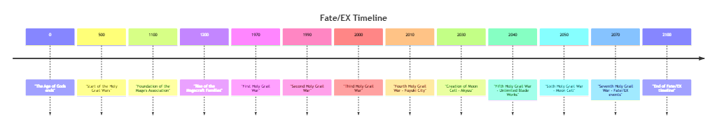
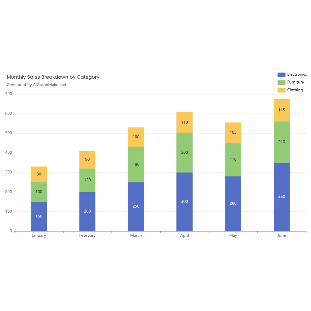
grouped bar chart-Business Analysis
Scenario: Comparing sales across different regions
Description
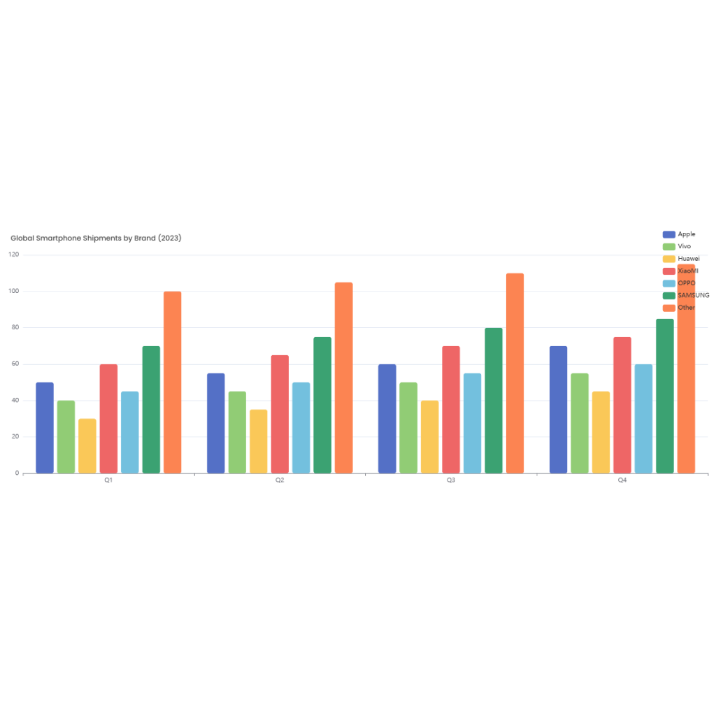
A grouped bar chart is a valuable tool for business analysis, particularly when comparing sales performance across different regions. This type of chart allows for a clear visual representation of sales data, making it easier to identify trends, patterns, and discrepancies among various regions.
In a grouped bar chart for regional sales comparison, each group of bars represents a specific time period, such as a month, quarter, or year. Within each group, individual bars are used to denote the sales figures for different regions. These bars are typically color-coded or pattern-coded to distinguish between regions at a glance.
The x-axis of the chart lists the time periods being analyzed, while the y-axis represents the sales figures. Each bar's height corresponds to the sales amount for that particular region in the given time period. This setup enables quick comparisons not only between regions within the same time period but also across different time periods for the same region.
For instance, if we are analyzing sales data for three regions—East, West, and South—each time period group on the chart will contain three bars, one for each region. By examining the chart, businesses can swiftly discern which region is leading in sales during each period and observe how sales in each region fluctuate over time.
This visual analysis aids businesses in making informed decisions. It can highlight underperforming regions that might need additional support or resources, as well as identify top-performing regions whose strategies could be replicated elsewhere. The grouped bar chart thus serves as a powerful instrument for driving strategic business decisions and optimizing sales performance across different geographical areas.