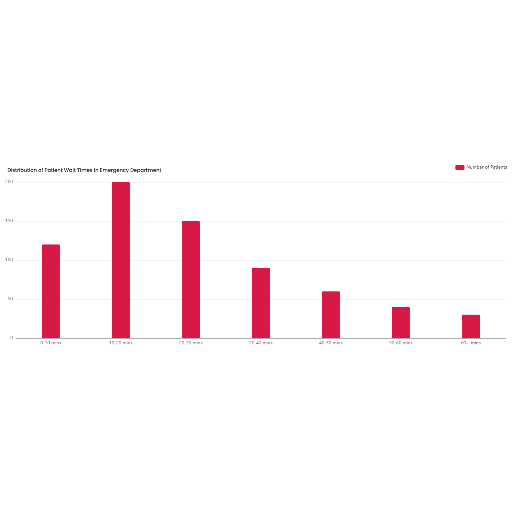
bar chart vs histogram-Population Distribution by Age Group
Scenario Description: A city wants to understand the distribution of its population in different age groups (such as 0 - 14 years old, 15 - 29 years old, 30 - 44 years old, 45 - 59 years old, and over 60 years old).
Description
## Bar Chart
A bar chart is an excellent tool to visualize the population distribution across different age groups. Each bar corresponds to an age group, such as 0 - 14, 15 - 29, etc., with the bar's length proportional to the population size of that group. This allows for a quick visual comparison between age groups.
### Advantages
- **Clear Comparison**: It's easy to compare the sizes of different age groups at a glance.
- **Discrete Categories**: Age groups are treated as distinct categories, making it straightforward to understand the distribution.
### Example
If a city has 20,000 people aged 0 - 14, 25,000 aged 15 - 29, 30,000 aged 30 - 44, 22,000 aged 45 - 59, and 15,000 aged 60+, the bar chart will show increasing bars from the first to the third group, then decreasing.
## Histogram
A histogram can also be used to show population distribution by age, especially when considering continuous age data. It groups ages into bins (which can be the same as the age groups) and shows the frequency of ages within each bin.
### Advantages
- **Data Distribution**: It provides a clear view of the data's distribution, showing patterns like skewness or symmetry.
- **Continuous Data**: It's useful when treating age as a continuous variable.
### Example
Using the same data as above, the histogram will have the same structure as the bar chart. However, if the data were more granular (e.g., individual ages), the histogram could show more detailed distribution patterns, like the number of people in each single year of age.
## When to Use Which
- **Bar Chart**: Ideal when you have predefined age groups and want to compare their populations directly. It's more common for this type of demographic data.
- **Histogram**: More useful when you have raw age data and want to explore the distribution in a continuous manner, or when you want to determine the optimal way to group the data.
Both charts can provide valuable insights into population distribution, helping city planners and policymakers make informed decisions based on age demographics.