Pie Chart for Project Task Allocation: Visualizing Team Member Workloads
Description
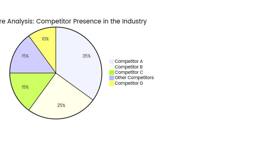
A pie chart is a powerful tool for visualizing how tasks are distributed among team members in a project, offering a clear snapshot of workload allocation and potential imbalances. This chart aids project managers in optimizing resource distribution, identifying bottlenecks, and ensuring equitable task assignment.
Key Components of the Pie Chart
- Team Members/Roles:
- Each slice represents an individual team member or role (e.g., Developer, Designer, QA Engineer).
- Example Labels:
- Alex (35%)
- Maria (25%)
- James (20%)
- Others (20%)
- Task Distribution Metrics:
- Slices are sized based on:
- Percentage of Total Tasks: Number of assigned tasks relative to the project total.
- Estimated Hours: Cumulative time allocated to each team member.
- Resource Allocation: Proportion of effort (e.g., 40% of total project hours).
- Slices are sized based on:
- Color Coding:
- Distinct colors differentiate team members for quick visual identification.
- Example: Alex (blue), Maria (green), James (red), Others (gray).
- Annotations:
- Exact percentages or hours are 标注 directly on slices.
- Additional notes highlight critical insights (e.g., "Alex: 35% (Project Lead)").
Interpretation & Insights
- Workload Balance:
- Ideal Scenario: Slices are roughly proportional to team capacity or role expectations.
- Red Flags:
- Overloaded team members (e.g., a slice >30% in a balanced team).
- Underutilized resources (e.g., a slice <10% without justification).
- Role Alignment:
- Ensure tasks align with expertise (e.g., a developer handling 70% of coding tasks).
- Project Phases:
- Adjust slices dynamically (e.g., QA Engineer’s workload increasing during testing phases).
- Risk Identification:
- A single large slice indicates dependency on one team member, risking delays if they are unavailable.
Example Scenario
Project: Mobile App Development
Team:
- Developer (40%)
- Designer (25%)
- QA Tester (20%)
- Project Manager (15%)
Insights:
- The developer has the largest workload, reflecting the project’s technical focus.
- The "Others" category (e.g., stakeholders, contractors) contributes 15% of effort.
Best Practices
- Limit Complexity:
- Include 5–7 key team members; group smaller contributors into "Others."
- Use Accurate Data:
- Base slices on quantifiable metrics (e.g., Jira tickets, estimated hours).
- Update Regularly:
- Refresh the chart weekly to reflect task reassignment or scope changes.
- Pair with Bar/Line Charts:
- Combine with burndown charts to track progress over time.
- Avoid Misleading Visuals:
- Use a 2D pie (not 3D) to prevent distortion; ensure percentages sum to 100%.
Strategic Applications
- Resource Optimization:
- Reallocate tasks if one team member is overburdened.
- Skill Development:
- Assign additional tasks to underutilized members to foster growth.
- Project Planning:
- Anticipate workload shifts during project phases (e.g., design → development → testing).
- Stakeholder Communication:
- Share the chart to justify resource needs or explain delays.
By visualizing workload distribution, the pie chart enables data-driven decisions, prevents burnout, and ensures projects stay on track through balanced teamwork.A pie chart is a powerful tool for visualizing how tasks are distributed among team members in a project, offering a clear snapshot of workload allocation and potential imbalances. This chart aids project managers in optimizing resource distribution, identifying bottlenecks, and ensuring equitable task assignment.
Key Components of the Pie Chart
- Team Members/Roles:
- Each slice represents an individual team member or role (e.g., Developer, Designer, QA Engineer).
- Example Labels:
- Alex (35%)
- Maria (25%)
- James (20%)
- Others (20%)
- Task Distribution Metrics:
- Slices are sized based on:
- Percentage of Total Tasks: Number of assigned tasks relative to the project total.
- Estimated Hours: Cumulative time allocated to each team member.
- Resource Allocation: Proportion of effort (e.g., 40% of total project hours).
- Slices are sized based on:
- Color Coding:
- Distinct colors differentiate team members for quick visual identification.
- Example: Alex (blue), Maria (green), James (red), Others (gray).
- Annotations:
- Exact percentages or hours are 标注 directly on slices.
- Additional notes highlight critical insights (e.g., "Alex: 35% (Project Lead)").
Interpretation & Insights
- Workload Balance:
- Ideal Scenario: Slices are roughly proportional to team capacity or role expectations.
- Red Flags:
- Overloaded team members (e.g., a slice >30% in a balanced team).
- Underutilized resources (e.g., a slice <10% without justification).
- Role Alignment:
- Ensure tasks align with expertise (e.g., a developer handling 70% of coding tasks).
- Project Phases:
- Adjust slices dynamically (e.g., QA Engineer’s workload increasing during testing phases).
- Risk Identification:
- A single large slice indicates dependency on one team member, risking delays if they are unavailable.
Example Scenario
Project: Mobile App Development
Team:
- Developer (40%)
- Designer (25%)
- QA Tester (20%)
- Project Manager (15%)
Insights:
- The developer has the largest workload, reflecting the project’s technical focus.
- The "Others" category (e.g., stakeholders, contractors) contributes 15% of effort.
Best Practices
- Limit Complexity:
- Include 5–7 key team members; group smaller contributors into "Others."
- Use Accurate Data:
- Base slices on quantifiable metrics (e.g., Jira tickets, estimated hours).
- Update Regularly:
- Refresh the chart weekly to reflect task reassignment or scope changes.
- Pair with Bar/Line Charts:
- Combine with burndown charts to track progress over time.
- Avoid Misleading Visuals:
- Use a 2D pie (not 3D) to prevent distortion; ensure percentages sum to 100%.
Strategic Applications
- Resource Optimization:
- Reallocate tasks if one team member is overburdened.
- Skill Development:
- Assign additional tasks to underutilized members to foster growth.
- Project Planning:
- Anticipate workload shifts during project phases (e.g., design → development → testing).
- Stakeholder Communication:
- Share the chart to justify resource needs or explain delays.
By visualizing workload distribution, the pie chart enables data-driven decisions, prevents burnout, and ensures projects stay on track through balanced teamwork.