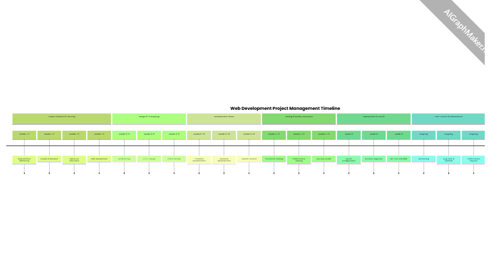
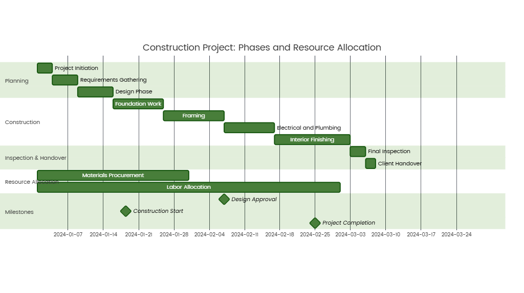
Sankey Diagram in Student Enrollment and Progression Tracking
{ name: 'A', value: 100 },
{ name: 'B', value: 80 },
{ name: 'C', value: 60 },
{ name: 'D', value: 40 },
{ name: 'E', value: 30 },
{ name: 'F', value: 20 },
{ name: 'G', value: 15 },
{ name: 'H', value: 10 }
],
links: [
{ source: 'A', target: 'B', value: 60 },
{ source: 'A', target: 'C', value: 40 },
{ source: 'B', target: 'D', value: 30 },
{ source: 'B', target: 'E', value: 30 },
{ source: 'C', target: 'D', value: 20 },
{ source: 'C', target: 'E', value: 20 },
{ source: 'C', target: 'F', value: 20 },
{ source: 'D', target: 'G', value: 15 },
{ source: 'D', target: 'H', value: 10 },
{ source: 'E', target: 'G', value: 15 },
{ source: 'E', target: 'H', value: 15 },
{ source: 'F', target: 'H', value: 20 }
Description
The Sankey diagram below illustrates student enrollment and progression through different academic stages, using node values to represent cohort sizes and link values to track transitions between stages. This visualization helps identify retention rates, bottlenecks, and typical pathways in student journeys.
Sankey Diagram Structure
Nodes (Academic Stages)
- A: Initial Enrollment (100 students)
- B: Stage 1 (e.g., Freshman Year) – 80 students
- C: Alternative Path 1 (e.g., Gap Year/Transfer) – 60 students
- D: Stage 2 (e.g., Sophomore Year) – 40 students
- E: Alternative Path 2 (e.g., Vocational Track) – 30 students
- F: Alternative Path 3 (e.g., Study Abroad) – 20 students
- G: Graduation – 15 students
- H: Withdrawal/Dropout – 10 students
Links (Transitions Between Stages)
SourceTargetStudents TransitioningDescription
A (Initial)
B (Stage 1)
60
60% of enrolled students progress to Stage 1.
A (Initial)
C (Alt 1)
40
40% opt for Alternative Path 1.
B (Stage 1)
D (Stage 2)
30
30 students advance to Stage 2 from Stage 1.
B (Stage 1)
E (Alt 2)
30
30 students switch to Alternative Path 2.
C (Alt 1)
D (Stage 2)
20
20 students return to main path from Alt 1.
C (Alt 1)
E (Alt 2)
20
20 students transition from Alt 1 to Alt 2.
C (Alt 1)
F (Alt 3)
20
20 students pursue Alternative Path 3.
D (Stage 2)
G (Graduate)
15
15 students graduate from Stage 2.
D (Stage 2)
H (Withdraw)
10
10 students withdraw from Stage 2.
E (Alt 2)
G (Graduate)
15
15 students graduate from Alternative Path 2.
E (Alt 2)
H (Withdraw)
15
15 students withdraw from Alternative Path 2.
F (Alt 3)
H (Withdraw)
20
All students in Alternative Path 3 withdraw.
Key Insights from the Sankey Diagram
- Initial Enrollment to Progression
- Only 80% of students (60 from A→B + 40 from A→C) proceed past the initial enrollment stage, indicating a 20% immediate attrition rate (e.g., due to admissions changes or financial issues).
- Stage 1 Retention
- From Stage 1 (B), 60% of students (30+30) transition to either Stage 2 (D) or Alternative Path 2 (E), while 20 students are unaccounted for (possibly withdrew directly from Stage 1, though not shown in links).
- Alternative Paths Impact
- Alternative Path 1 (C) is the most common initial detour (40 students from A), but only 20 students (50%) from C return to the main Stage 2 (D), while 40% (20+20) shift to other alternative paths or withdraw.
- Alternative Path 3 (F) has the highest attrition, with all 20 students eventually withdrawing (F→H).
- Final Graduation Rate
- Total graduates (G) = 15 (from D) + 15 (from E) = 30 students, representing a 30% overall graduation rate from the initial enrollment cohort (100 students).
- Withdrawals (H) = 10+15+20 = 45 students (45% attrition rate).
- Bottlenecks
- The largest drop occurs between Stage 2 (D/E) and graduation, with 50% of students in D/E withdrawing (10+15 = 25 students). This suggests challenges in upper-level coursework or program fit.
Applications of the Sankey Diagram
- Institutional Planning: Identify stages with high attrition (e.g., Stage 2, Alternative Path 3) and implement interventions like academic advising or career support.
- Resource Allocation: Redirect resources to underperforming paths (e.g., improve support for students in Alternative Paths to reduce H transitions).
- Student Counseling: Use data to guide students toward higher-retention pathways (e.g., emphasize Stage 1→D for better graduation odds).
- Policy Evaluation: Assess whether alternative paths (e.g., study abroad) are meeting student needs or contributing to attrition.
Visual Interpretation Tips
- Width of Links: Proportional to the number of students transitioning (e.g., A→B is thicker than A→C, reflecting 60 vs. 40 students).
- Node Sizing: Larger nodes indicate larger cohorts (e.g., A is the widest, G and H are the narrowest).
- Path Analysis: Trace individual journeys (e.g., A→C→D→G: 20 students take the gap year path and graduate).
By visualizing student flows through academic stages, the Sankey diagram provides a dynamic overview of enrollment trends and helps stakeholders address systemic issues affecting retention and graduation rates.