How to make radar chart in excel
For Excel users, pie charts, bar charts, and line graphs are common chart types. However, there’s a relatively lesser-known chart – the radar chart (also known as a spider chart or star chart). This chart presents rich information in a visually impactful way within a single graph. It’s ideal for comparing multiple items across various metrics. For example, you can use it to assess different performance indicators of a product or quickly compare how multiple competitors perform across different market dimensions.
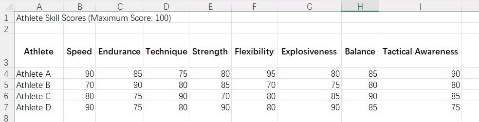
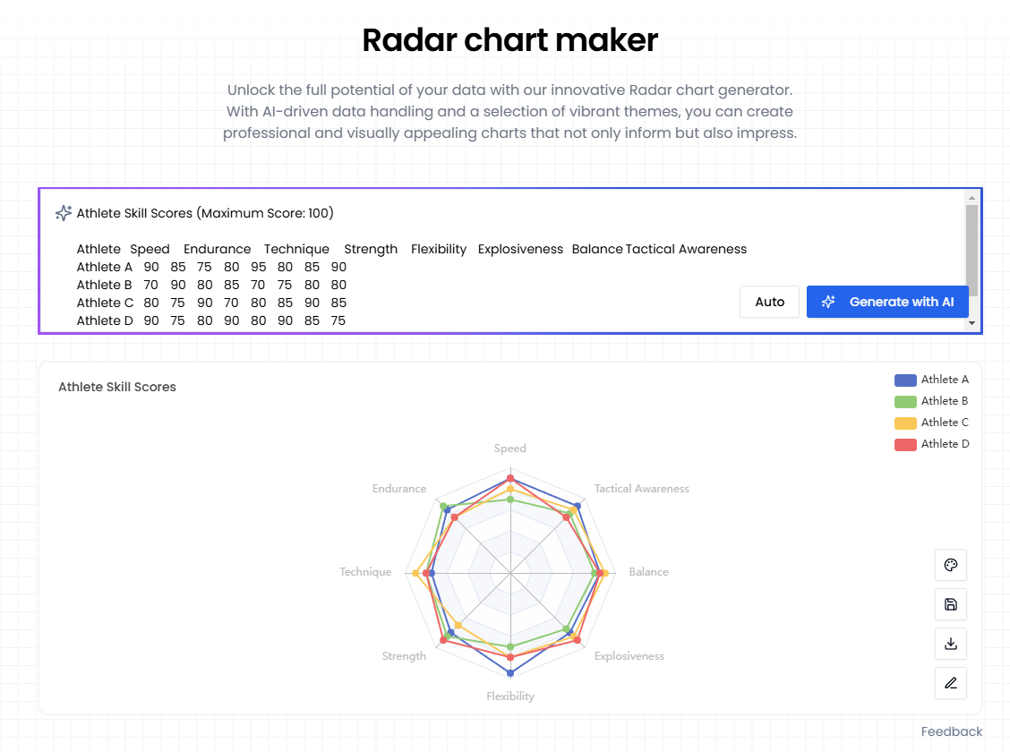
In Excel, we are creating a chart to showcase the performance scores of different athletes across eight key skills, with each score out of 100. This will assist coaches and analysts in evaluating the athletes' overall abilities and potential for growth. We have collected data on four athletes across the following dimensions: speed, endurance, technique, strength, flexibility, explosiveness, balance, and tactical awareness. While the table presents the data, it doesn't provide a clear visual comparison to easily identify which athlete performs best overall (if any).
The following steps were carried out and images were captured on a Windows 11, 64-bit system, Excel version 2421.
Create a Radar Chart
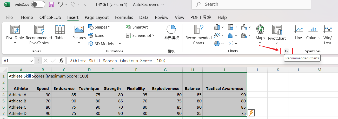
- Choose the data you want to include in the chart.
- After selecting the data, go to the "Insert" tab and click on "Recommended Charts" in the "Charts" group.
In the pop-up dialog, switch to the "All Charts" tab, click on the "Radar" button on the left, and then choose a suitable option from the radar chart templates to meet your needs.
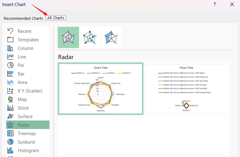
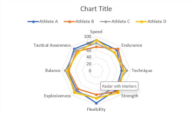
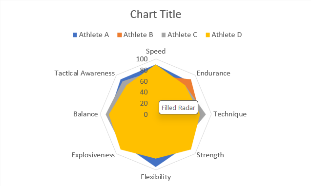
You can choose from three default radar chart styles: Basic Radar, Radar with Markers, and Filled Radar.
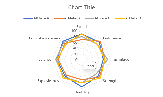
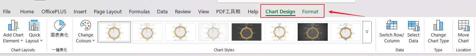
Once the chart is created, you can customize it just like any other chart by adjusting elements such as colors, labels, and text. Double-click the chart to access the "Design" and "Format" tabs, where you can find chart styles and other editing tools to personalize your chart.
In the AI era, you can easily generate radar charts with the help of AI. Simply input your data into our AI Radar chart maker, click the "Generate with AI" button, and the system will quickly create a radar chart for you.
Radar charts can be a bit controversial. On one hand, they are great for displaying certain types of data, allowing you to showcase multiple variables in one view. On the other hand, they can sometimes result in cluttered visuals that make the data harder to interpret. The key to using radar charts effectively is choosing the right context. They should be applied only in situations where they add value, helping you maximize their strengths while avoiding potential downsides.