How AI Graph Maker Tools Simplify HR Reporting: Visualizing Performance Data in Charts
In today’s data-driven workplace, Human Resources (HR) professionals handle an increasing volume of data - from employee attendance records and performance scores to engagement surveys and turnover rates. Transforming these numbers into actionable insights is essential for making informed management decisions, improving team productivity, and driving organizational growth. However, traditional methods of creating HR reports are often time-consuming and require technical skills in spreadsheet software or data visualization platforms. This is where AI-powered graph maker tools are changing the game.
Why Performance Data Visualization Matters in HR
Performance data is one of the most valuable resources for any HR department. It reflects employee contributions, highlights areas for improvement, and informs promotion or compensation decisions. But when presented in raw tables or text-heavy reports, its impact can be lost. Visualizing this data helps managers and executives quickly grasp patterns, identify top performers, and spot issues such as performance drops or absenteeism.
AI graph maker tools enable HR teams to automatically convert performance data into clear, interactive, and professional-looking charts all without needing advanced data skills. With just a few inputs, these tools can instantly create bar charts, line graphs, or dashboards that summarize KPIs like employee productivity, goal achievement, and performance trends.
How AI Graph Makers Help HR Professionals
- Automating Report Creation AI-powered graph makers can directly import HR data from spreadsheets, databases, or cloud HR systems. The AI detects the structure of the data and suggests appropriate chart types, reducing the time spent manually building graphs.
- Highlighting Key Insights AI tools can automatically analyze performance trends, highlight outliers, and suggest visual storytelling elements. For example, if a particular team consistently exceeds targets, or if performance declines in a specific quarter, the AI can flag these insights visually.
- Customizing Visuals for Different Stakeholders HR teams often need to present data differently to executives, managers, and employees. AI graph makers allow users to easily adjust chart layouts, colors, and labels based on the audience, ensuring clarity and relevance.
- Real-Time Updates and Interactive Dashboards Some AI tools integrate with live data sources, enabling HR teams to create dynamic dashboards that automatically update as new performance data is collected. This is especially useful for quarterly reviews or ongoing performance improvement initiatives.
Real-World Example: Visualizing Department Performance Data
To illustrate, let’s consider a company tracking the quarterly performance of its Sales, Marketing, HR, and Operations teams in 2024. The HR manager wants to visualize the following average performance scores (on a 5-point scale):
| Department | Q1 | Q2 | Q3 | Q4 |
| Sales | 4.2 | 4.5 | 4.7 | 4.6 |
| Marketing | 3.8 | 4 | 4.2 | 4.3 |
| HR | 4 | 4.1 | 4 | 4.2 |
| Operations | 3.9 | 4.2 | 4.1 | 4 |
By using an AI graph maker, the HR manager can instantly generate different types of charts to uncover various insights from this dataset.
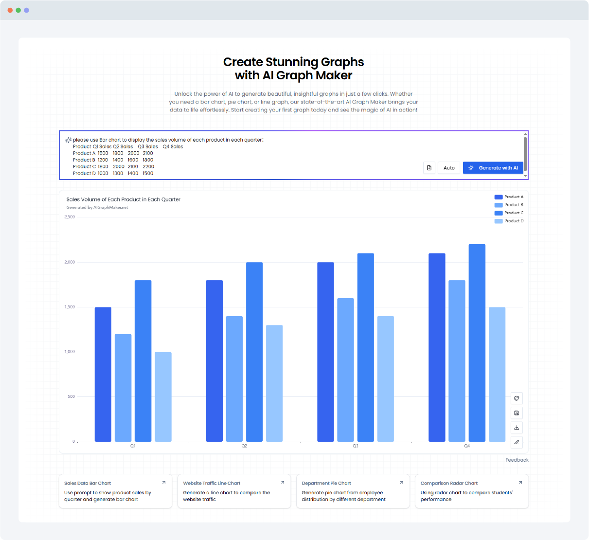
? Visualization Prompt Examples (Ready to Use)
Here are several prompt examples that the HR team can use directly in an AI graph maker tool to visualize this data:
✅ Line Chart Prompt
Create a line chart showing the performance trends of four departments
Sales, Marketing, HR, and Operations
over four quarters in 2024. The x-axis represents the quarters (Q1, Q2, Q3, Q4), and the y-axis shows the average performance rating (0 to 5).
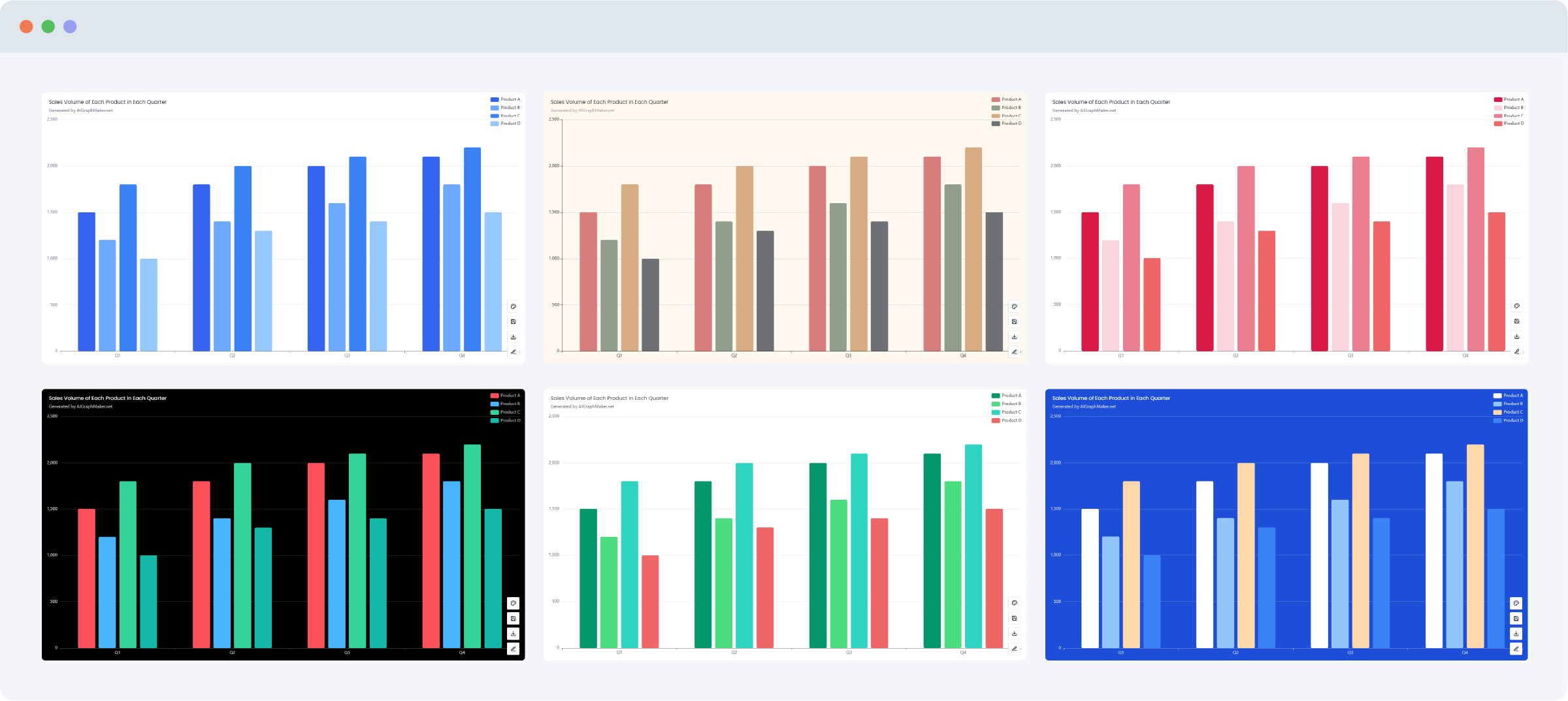
Each department should have its own colored line with data point markers. Include a legend and the title: "Quarterly Performance Trends by Department (2024)".✅ Bar Chart Prompt
Generate a bar chart comparing the average performance ratings of four departments
Sales, Marketing, HR, and Operations
for each quarter in 2024. The x-axis should display the departments, and the y-axis should show the performance rating (from 0 to 5). Group the bars by quarter (Q1, Q2, Q3, Q4) using different colors. Add a legend and a title: "Department Performance Comparison by Quarter (2024)".
✅ Stacked Bar Chart Prompt
Create a stacked bar chart displaying the quarterly performance ratings for four departments
Sales, Marketing, HR, and Operations - in 2024.
The x-axis should represent the quarters (Q1, Q2, Q3, Q4), and the y-axis should show the total combined performance rating.
Each bar should be divided into colored segments representing each department’s rating in that quarter. Include a legend and title: "Stacked Performance Ratings by Quarter (2024)".
✅ Radar (Spider) Chart Prompt
Generate a radar chart (spider chart) to compare the average performance ratings of four departments
Sales, Marketing, HR, and Operations
across four quarters in 2024. Each axis should represent a quarter (Q1, Q2, Q3, Q4) and the values should range from 0 to 5. Each department should have its own colored area on the chart. Include a legend and the title: "Department Performance Radar Chart (2024)".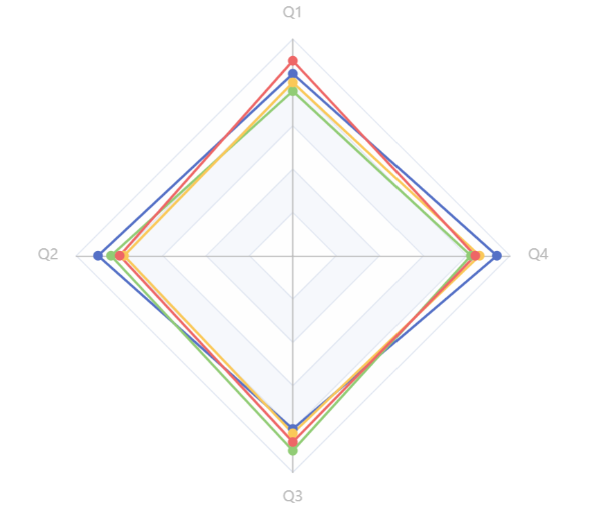
? Conclusion
AI graph maker tools are revolutionizing how HR professionals present performance data. By automating chart creation, uncovering trends, and simplifying customization, these tools help HR teams deliver clearer, faster, and more persuasive reports.
Through real-world examples like quarterly performance visualization, HR professionals can instantly turn complex datasets into understandable and actionable visuals.
These AI-generated visualizations not only save time and effort but also enhance the impact of HR presentations to executives, managers, and employees alike. For HR teams looking to modernize their reporting processes and impress stakeholders with clear, data-driven insights, adopting AI graph maker tools is a smart, future-ready move.
English