How to Create a Pie Chart: A Step-by-Step Guide (with Templates)
Pie charts are a powerful and intuitive way to visualize data. They clearly illustrate how individual parts relate to a whole—making them ideal for showing percentages, proportions, and distributions. Whether you're visualizing budget allocations, market share, or survey results, a pie chart offers a clean and easy-to-read format that anyone can understand at a glance.
In this guide, we’ll show you exactly how to make a pie chart—from inputting your data to customizing and exporting the final graphic. Plus, we’ll provide practical templates you can use right away. If you're using an AI-powered chart maker like AI Graph Maker, the process is fast, easy, and completely code-free.
What Is a Pie Chart?
A pie chart is a circular graph divided into segments, each representing a portion of a whole (100%). The size of each slice corresponds to its percentage of the total. This format makes it incredibly simple to communicate how different categories compare to each other in terms of value or volume.
For example, when analyzing website traffic, you might use a pie chart to display the proportion of users coming from direct visits, search engines, social media, and referrals. The clean, visual breakdown makes key insights immediately clear.
Step-by-Step: How to Make a Pie Chart
1. Enter Your Data
To start, gather your data. A pie chart needs category labels and corresponding numerical values. Your data might include things like spending categories, product sales, survey results, or demographic breakdowns.
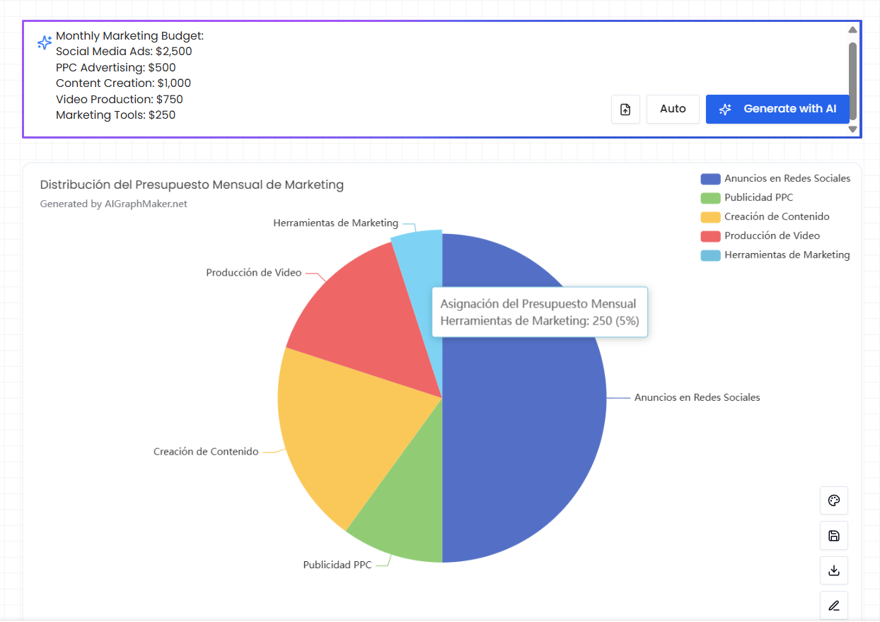
Example – Monthly Marketing Budget:
- Social Media Ads: $2,500
- PPC Advertising: $500
- Content Creation: $1,000
- Video Production: $750
- Marketing Tools: $250
Simply enter this data into a pie chart generator like AI Graph Maker, which automatically processes it for chart creation.
2. Generate the Pie Chart
After entering your values, click "Generate" to create the pie chart. With an AI chart maker, the system automatically calculates proportions, assigns colors, and renders a visually balanced chart.
There’s no need for design skills, the AI takes care of layout and styling, ensuring your pie chart is clear, accurate, and professional.
3. Customize Your Chart
Most pie chart makers allow you to personalize the chart to suit your presentation or branding needs. Common customization options include:
- Colors: Adjust segment colors to match your theme or branding.
- Labels: Add or edit data labels for better clarity.
Design elements: Include a title, legend, or background to enhance readability.
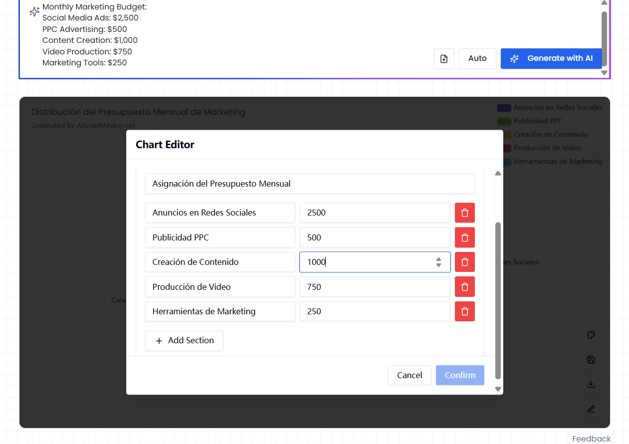
These simple edits can transform your chart from basic to presentation-ready.
4. Download or Share
Once finalized, download your chart in high-resolution formats like PNG or SVG. You can also embed the chart in reports, slide decks, or web pages or share it directly via a link.
Key Features of Pie Charts
1. Clear Representation of Proportions
Pie charts are ideal for showing how various parts make up a whole. They work best for visualizing percentage data such as revenue distribution, market share, or poll results.
For instance, in a pie chart showing smartphone market share, you can instantly see which brands dominate and which lag behind.
2. Simple and Easy to Understand
The circular layout and slice-based design make pie charts universally recognizable. Even viewers without a data background can easily interpret them, making them a perfect choice for both professional reports and public presentations.
3. Efficient Information Delivery with AI Tools
Thanks to AI-powered pie chart maker, you can produce a clean, attractive chart in seconds. This saves time while ensuring your visuals remain sharp and data-driven. The simplicity and speed of tools like AI Graph Maker make them perfect for quick visualizations.
Pie Chart Templates (Use Cases)
To help you get started, here are several example pie chart templates covering a range of real-world scenarios:
1. Website Analytics Pie Chart
Visualize traffic sources, device usage, or bounce rates to optimize digital strategy.
2. Product Sales Pie Chart
Compare how different products contribute to total revenue or units sold.
3. Survey Results Pie Chart
Show customer satisfaction levels or preferences in a visual, digestible format.
4. Budget Allocation Pie Chart
Break down company or personal budgets by category for better financial planning.
5. Age Distribution Pie Chart
Analyze the age makeup of your customers, survey respondents, or event attendees.
6. Market Share Pie Chart
Compare competitor presence within a given industry or niche.
7. Personal Expense Pie Chart
Track household spending habits or visualize monthly expenses for financial awareness.
8. Academic Performance Pie Chart
Display grade distributions across a class or subject to support educational insights.
9. Product Type Pie Chart
Understand which categories drive the most sales or engagement.
10. Regional Sales Pie Chart
Identify top-performing areas and markets that need growth strategies.
Conclusion
Pie charts are one of the most effective tools for visualizing data relationships and percentages. With the help of an AI Graph Maker, you can create professional-looking pie charts in just a few clicks—no design experience needed.
From marketing analytics to financial reports and educational summaries, pie charts deliver clarity and impact. Use the templates above to get inspired, and start building your own graphs with AI-powered chart tools today.
If you're ready to make your next pie chart, try AI Graph Maker—the easiest way to create stunning, data-driven visuals in seconds.