Improve Your Social Media Posts with AI-Generated Charts
Social media thrives on visuals, and charts aren’t just for business reports anymore. With the rise of AI graph makers, creating engaging, clear, and insightful charts is easier than ever. You don’t need to be a data analyst or graphic designer, just feed in a few words or numbers, and let AI handle the rest.
In this article, we’ll explore 10 practical ways to use AI-generated charts to enhance your social media content with clear data examples you can try.
what you need to do is just to paste the content into aigraphmaker.net, and click the ai button to generate your pernsanlized chart and boost your post quality.
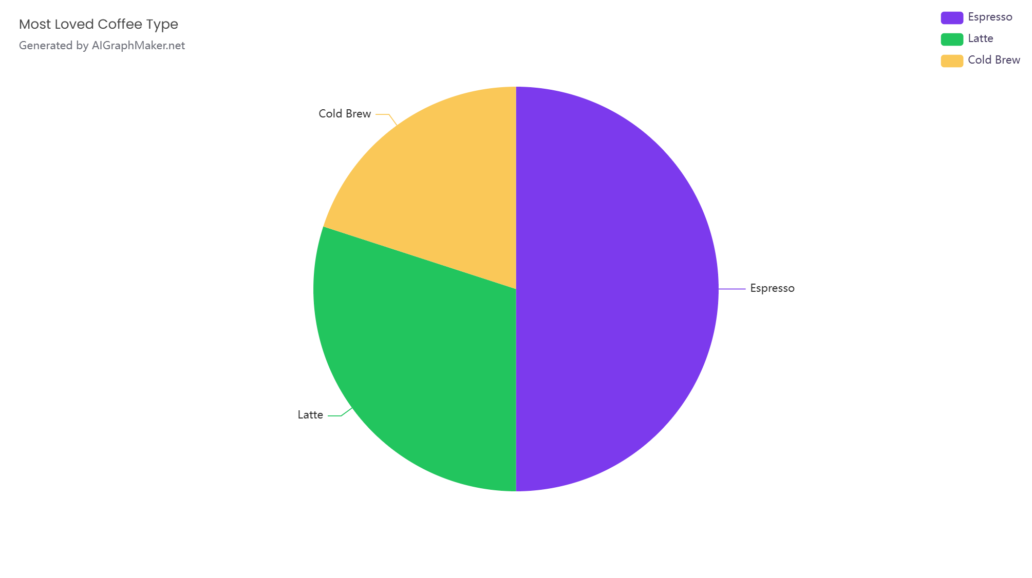
1. Poll Results Breakdown
After running a quick poll, turn the results into a clean, visual chart. This makes your audience feel involved and gives your post a professional touch.
Example:
Which type of coffee do you love most?
- Espresso: 500 votes
- Latte: 300 votes
- Cold Brew: 200 votes
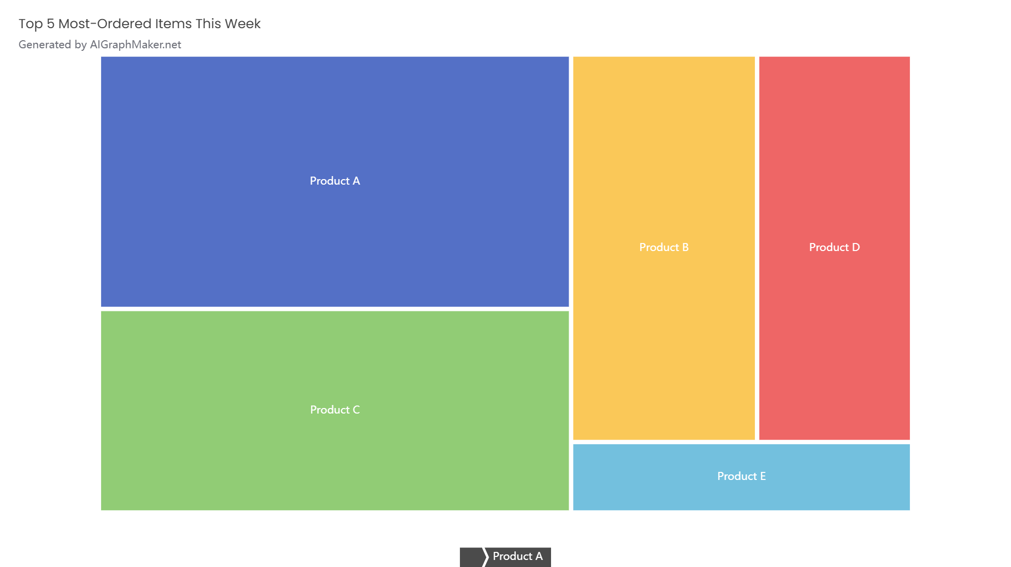
2. Product Popularity Comparison
If you sell products or services, show which ones are the most popular using a comparison chart. It builds social proof and highlights your bestsellers.
Example:
Top 5 Most-Ordered Items This Week
- Product A: 500 sales
- Product B: 300 sales
- Product C: 400 sales
- Product D: 250 sales
- Product E: 100 sales
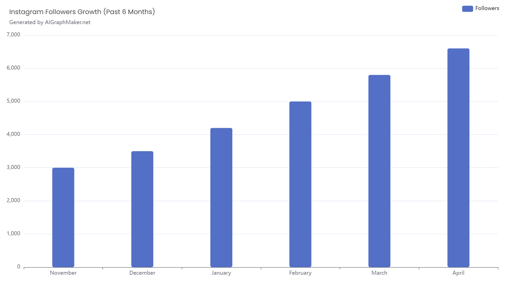
3. Trend Growth Over Time
Track how your followers, sales, or website visits have increased over time with a line chart.
Example:
Instagram Followers Growth (Past 6 Months)
- November: 3,000
- December: 3,500
- January: 4,200
- February: 5,000
- March: 5,800
- April: 6,600
4. Audience Demographics
Share audience demographics to highlight who’s engaging with your content.
Example:
Where Are Our Followers From, give me a piechart?
- United States: 1,200 followers
- United Kingdom: 800 followers
- Australia: 500 followers
- Canada: 400 followers
- Others: 600 followers

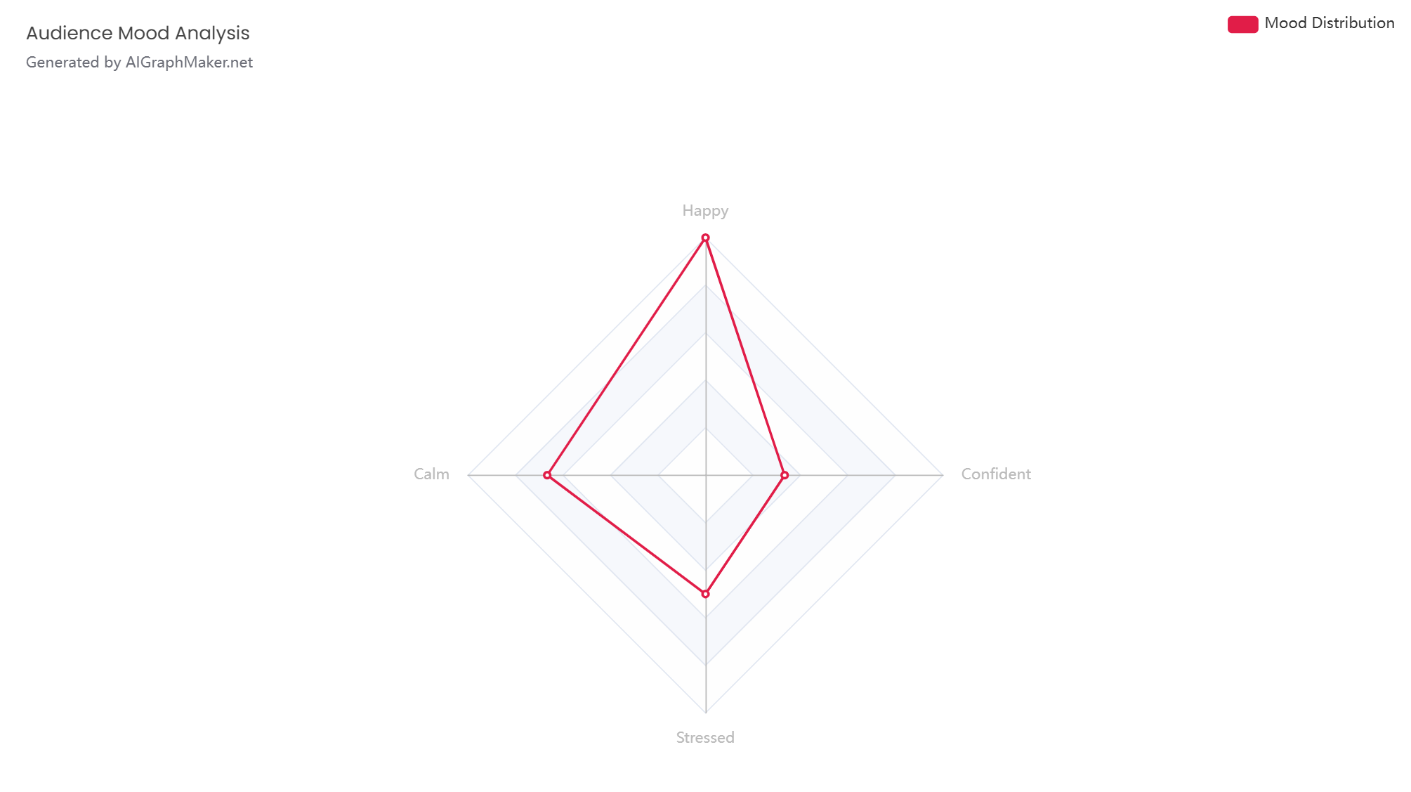
6. Mood or Vibe Charts
Visualize how your audience feels on a given day or week.
Example:
What’s Your Mood Today?
- Happy: 600 responses
- Calm: 400 responses
- Stressed: 300 responses
- Confident: 200 responses
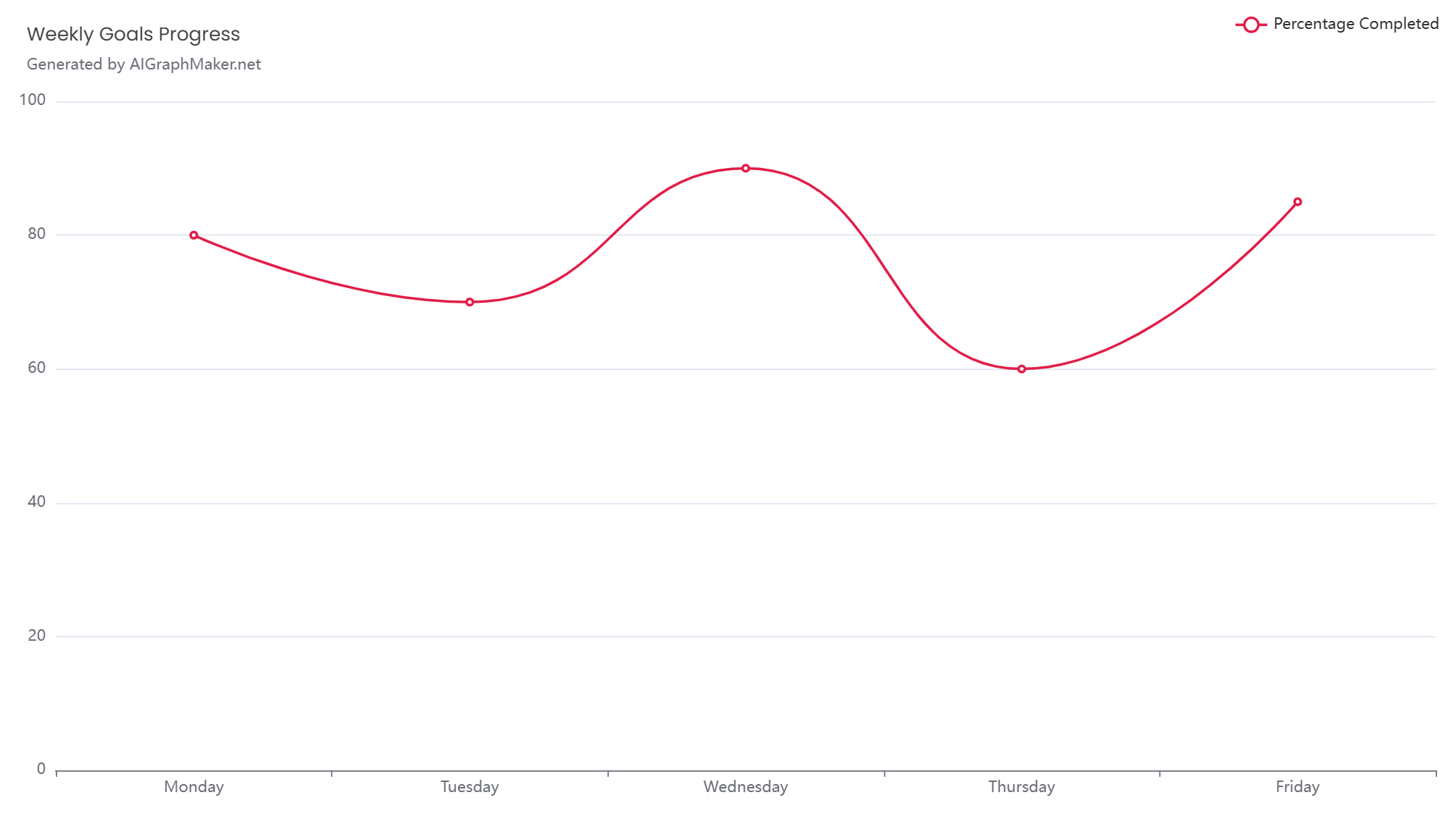
7. Daily or Weekly Goals Tracker
Show your progress using AI-generated progress or donut charts.
Example:
Weekly Goals Completed
- Monday: 80%
- Tuesday: 70%
- Wednesday: 90%
- Thursday: 60%
- Friday: 85%
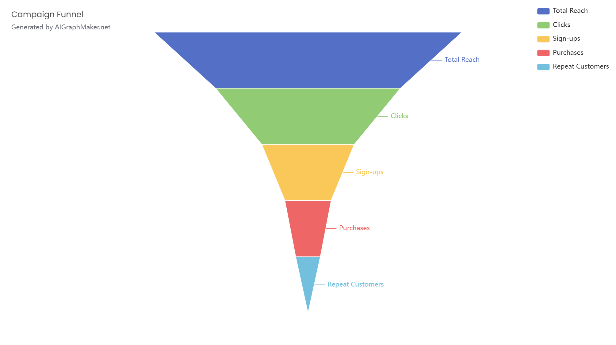
8. Funnel Chart for Social Media Campaign Conversion
A funnel chart is great for showing drop-off rates at each stage of a campaign.
Example:
Campaign Funnel
Total Reach: 10,000
Clicks: 6,000
Sign-ups: 3,000
Purchases: 1,500
Repeat Customers: 800
It quickly highlights where you’re losing people and how well your campaign is converting.
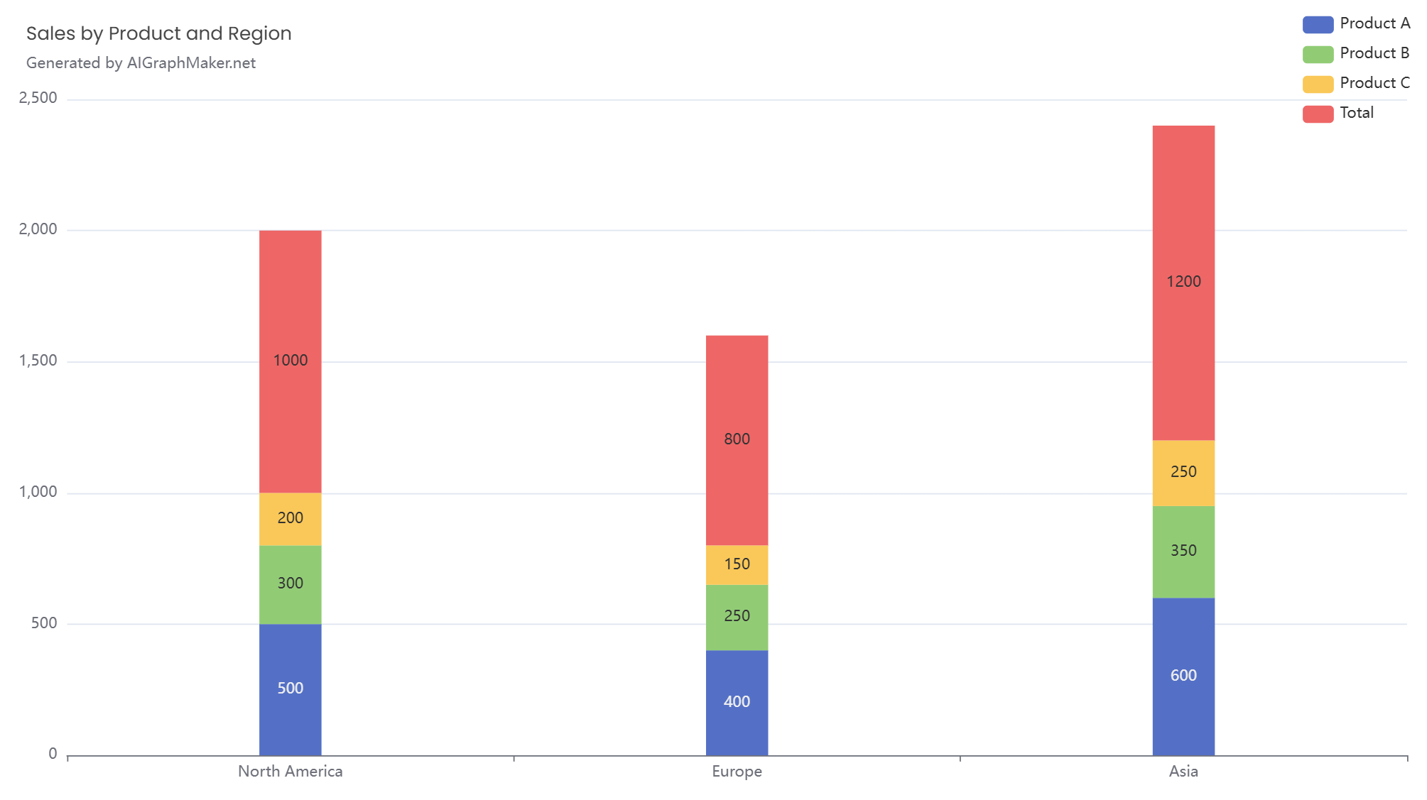
9. Stacked Bar Chart for Sales by Region and Product
A stacked bar chart shows how different products contribute to sales in each region.
Example:
Sales by Product and Region
North America:
Product A: 500
Product B: 300
Product C: 200
Total: 1000
Europe:
Product A: 400
Product B: 250
Product C: 150
Total: 800
Asia:
Product A: 600
Product B: 350
Product C: 250
Total: 1200
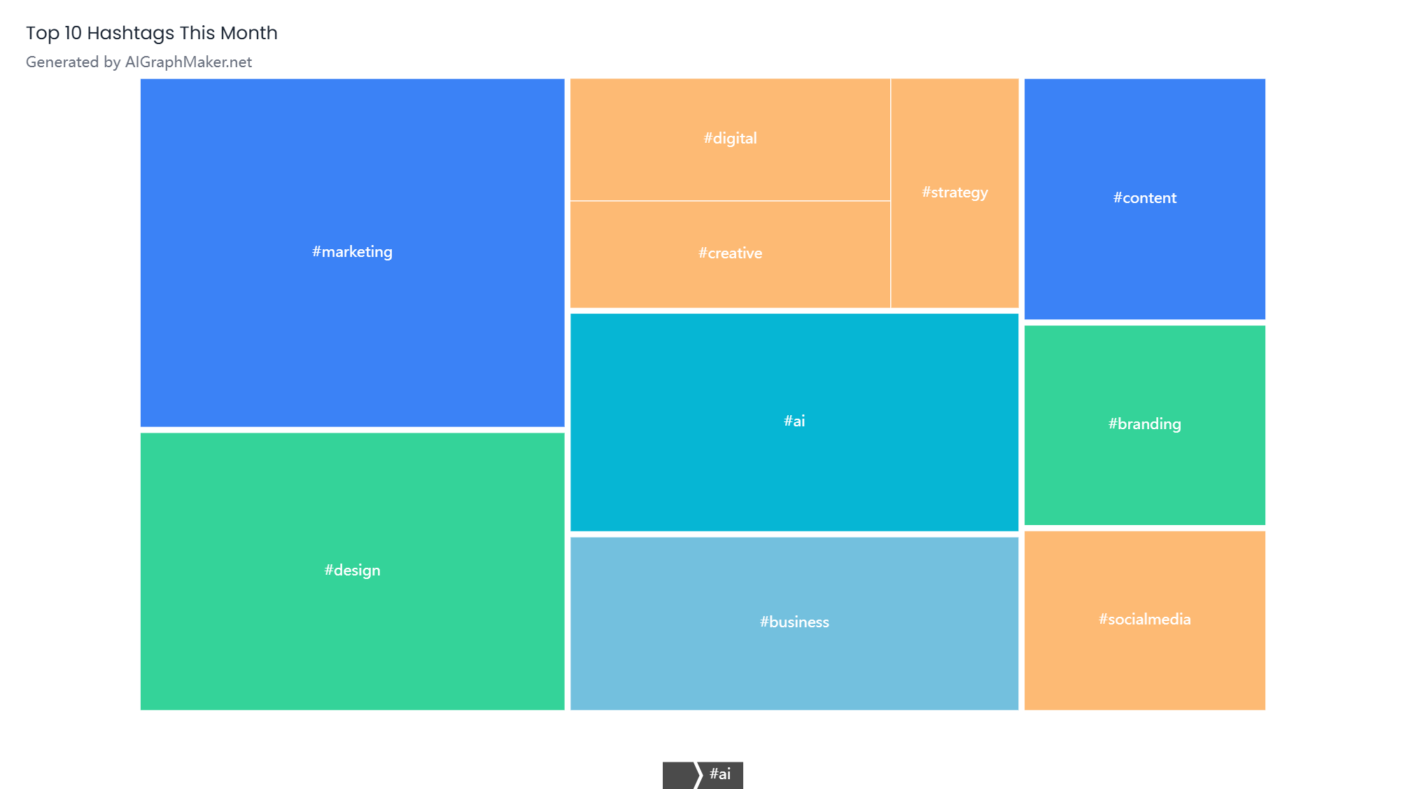
10. Hashtag Usage or Word Cloud
Visualize your most-used hashtags to reflect your brand focus.
Example:
Top 10 Hashtags This Month
- #marketing: 150 uses
- #design: 120 uses
- #ai: 100 uses
- #business: 80 uses
- #content: 60 uses
- #branding: 50 uses
- #socialmedia: 45 uses
- #digital: 40 uses
- #creative: 35 uses
- #strategy: 30 uses
Final Thoughts
AI-generated charts and graph maker aren’t just for internal reports — they’re practical, engaging tools for storytelling and audience interaction on social media. Whether you’re highlighting growth, sharing fun facts, or reporting quiz results, clear data visuals help your content stand out and get noticed.