Stacked Bar Chart Feature Launched on AI Graph Maker
AI Graph Maker continues to evolve, making data visualization easier and more powerful than ever! We’re excited to announce the release of the Stacked Bar Chart feature, allowing users to create insightful multi-category bar charts effortlessly.
This new feature enables you to compare multiple data series within the same bar, making it perfect for showcasing trends, distributions, and category breakdowns. Whether you're analyzing survey results, financial data, or statistical trends, the stacked bar chart provides a clear and effective way to communicate complex information.
Let us try it now:
Your prompt:
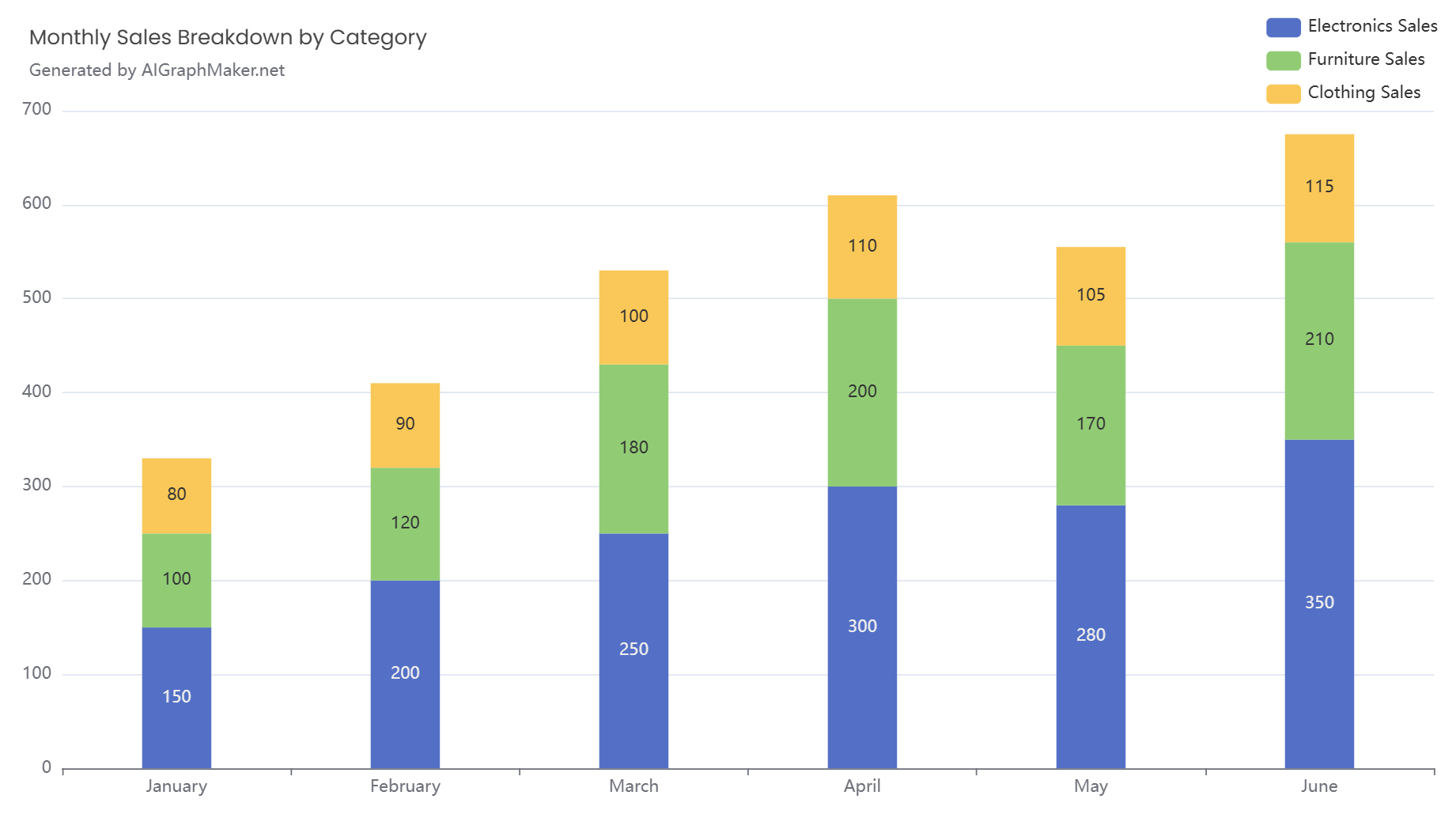
Create a stacked bar chart displaying sales performance across multiple regions. Each bar should represent a month from January to June, and each stack should show sales contributions from different product categories: Electronics, Furniture, and Clothing. Use distinct colors for each category. Add axis labels, a legend, and a clear title: 'Monthly Sales Breakdown by Category'

Sample Data:
Months: January, February, March, April, May, June
Electronics Sales: 150, 200, 250, 300, 280, 350
Furniture Sales: 100, 120, 180, 200, 170, 210
Clothing Sales: 80, 90, 100, 110, 105, 115
and finally, you will get a stacked barchart in AIGraphMaker generator like this:
If your prompt is below:
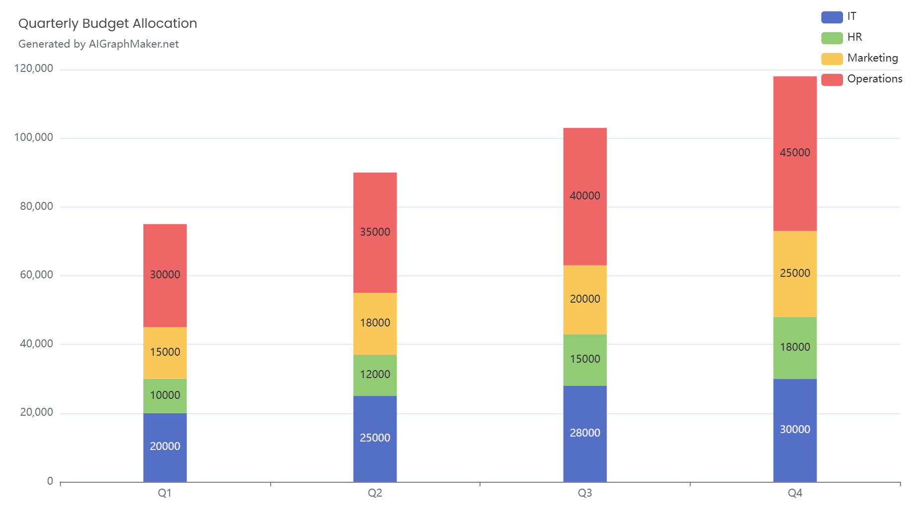
Create a stacked bar chart displaying budget allocation for each department over four quarters. Each bar should represent a quarter, and the stacks should show the budget for IT, HR, Marketing, and Operations. Add axis labels, a legend, and a title: 'Quarterly Budget Allocation'.

Sample Data:

Quarters: Q1, Q2, Q3, Q4
IT: 20K, 25K, 28K, 30K
HR: 10K, 12K, 15K, 18K
Marketing: 15K, 18K, 20K, 25K
Operations: 30K, 35K, 40K, 45K
You will get the following chart
so let's try it out now and take your data visualization to the next level! ?