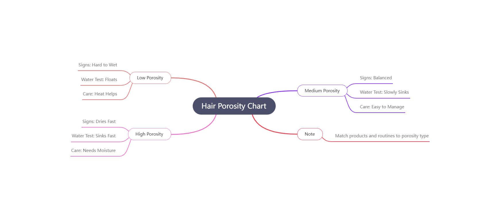
Create a MindElixir mind map for chart of accounts for airbnb. The root node is the topic. Add five main branches: money in, money out, what you own, what you owe, and setup items. Under money in add room income, cleaning fees, service fees, and refunds. Under money out add supplies, maintenance, utilities, marketing, platform fees, and taxes. Under what you own add cash, bank, furniture, and equipment. Under what you owe add loans, deposits held, and bills due. Under setup items add opening balance and monthly review. Use a clear left to right layout, icons for money and tools, and concise labels.
Description
What is chart of accounts for airbnb
chart of accounts for airbnb is a simple map of money in and money out for a hosting business. It groups items so you can see where money comes from and where it goes. A clear chart can use 5 main groups and about 15 lines so it stays easy to scan. This helps hosts keep records clean, plan budgets, and explain results without long reports. It is a practical view that can be used by a single host or a small team.
- Keep money records clear
- Group income and costs simply
- Support monthly reviews
- Make reports easy to share
Money in categories
Money in categories can include room income, cleaning fees, and service fees. You can also add refunds as a separate line so you can track changes clearly. A short list of 4 to 6 lines is often enough for a small hosting setup.
When to use chart of accounts for airbnb diagrams/charts
Use this chart when you set up a new listing, start a monthly review, or prepare for a year end check. It is also helpful when you add a second property and want to keep both records consistent. A clear chart helps you compare results across 12 months and spot cost changes early.
Money out categories
Money out categories can include supplies, maintenance, utilities, marketing, platform fees, and taxes. Keep each line simple and avoid extra detail. If you track 6 to 8 cost lines, it is usually enough to see where money is going.
How to generate the chart of accounts for airbnb (graph/diagram/chart/drawing)
Open the diagram generator and choose a mind map layout. Set the root node as your main topic and add five main branches for money in, money out, what you own, what you owe, and setup items. Keep each branch short and use plain labels. Try different prompt words like hosting income or monthly review to see new layouts.
Monthly review plan
A monthly review plan keeps the chart useful. Set a reminder for day 5 of each month and update the lines with the last month totals. This small habit keeps the chart accurate and makes year end reviews much easier.
Similar Prompt Examples
Create a mind map that groups hosting income and costs into five simple branches with clear labels.
Generate a chart of accounts map for a rental host with money in, money out, what you own, and what you owe.
Build a mind map for a short term rental budget with clean branch names and a left to right layout.
FAQs
Do I need a complex chart for a single property? No. A small chart with a few clear lines is enough for one property. Focus on the big categories and keep it simple. You can always add detail later if you grow or if your reports need more depth.
Should I separate cleaning fees from room income? It helps to separate them because they behave differently. Room income is your main flow while cleaning fees are tied to each stay. Keeping them separate makes it easier to see true earning trends over time.
How often should I update the chart? Monthly updates work well for most hosts. If you have many bookings, you can also do a quick weekly check. The goal is to keep records fresh so you can make decisions with recent numbers.
Can this chart support tax time? Yes. A clean chart makes it easier to collect totals for the year. Keep receipts and match them to the right line. This reduces stress at tax time and helps avoid missed items.
What if my costs do not fit a category? Create a small other line and use it sparingly. If it grows, split it into a new clear category. The chart should stay simple but still reflect how you actually spend money.
Similar Links
1. Mermaid Diagram
2. Mermaid Diagram
3. The AI-Powered Healthcare Ecosystem
These references help you plan your next chart of accounts for airbnb