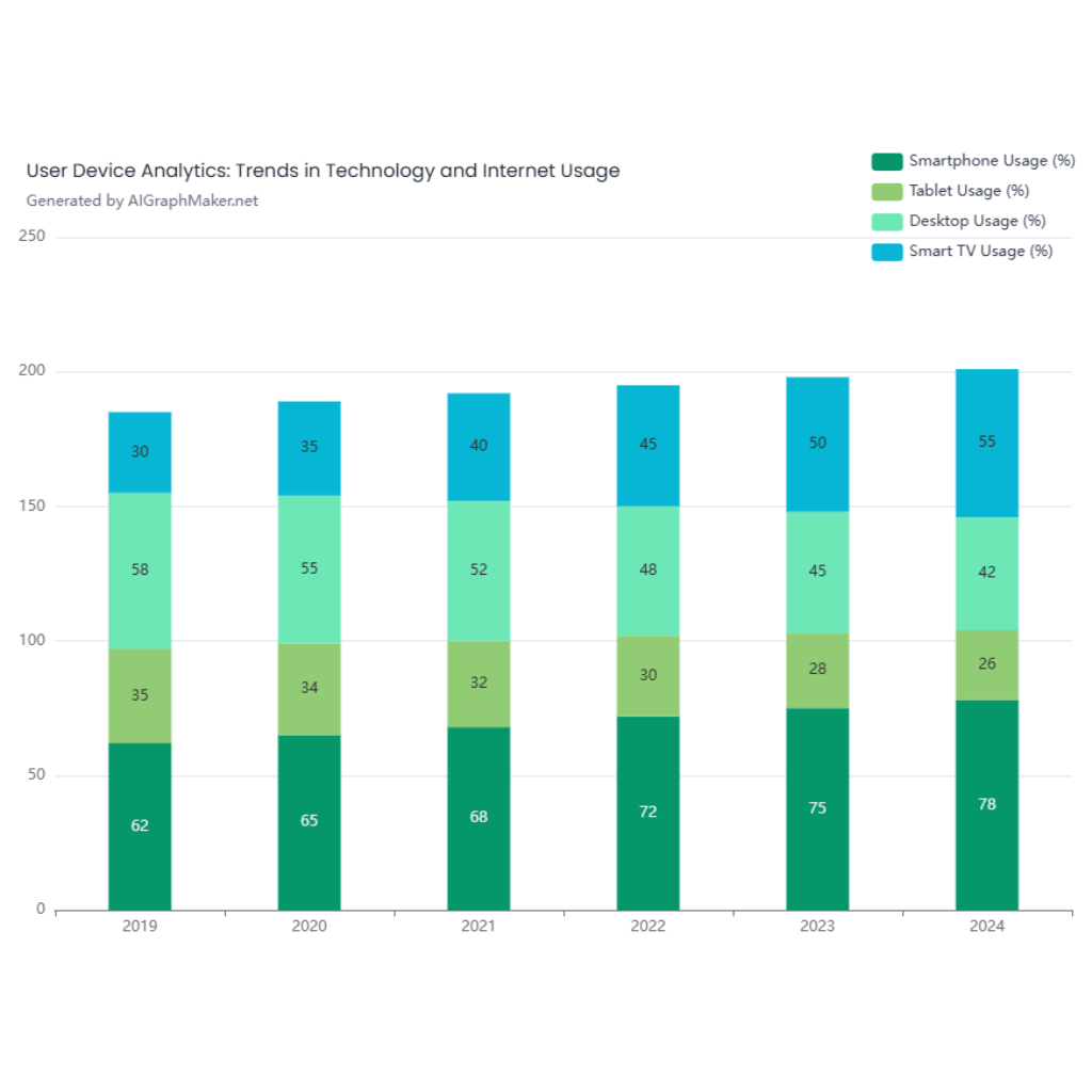
Create a stacked bar chart displaying sales performance across multiple regions. Each bar should represent a month from January to June, and each stack should show sales contributions from different product categories: Electronics, Furniture, and Clothing. Use distinct colors for each category. Add axis labels, a legend, and a clear title: 'Monthly Sales Breakdown by Category'
Sample Data:
Months: January, February, March, April, May, June
Electronics Sales: 150, 200, 250, 300, 280, 350
Furniture Sales: 100, 120, 180, 200, 170, 210
Clothing Sales: 80, 90, 100, 110, 105, 115
Description
## Description
This stacked bar chart provides a clear visual representation of monthly sales performance across three product categories: Electronics, Furniture, and Clothing. Each bar corresponds to a month from January to June, with each segment within the bar illustrating the sales contribution from each category. The use of distinct colors for Electronics, Furniture, and Clothing allows for easy differentiation and analysis of sales trends.
## Key Features
- **Months on X-axis**: The horizontal axis lists the months from January to June, providing a chronological view of sales performance.
- **Sales Values on Y-axis**: The vertical axis represents the sales values, indicating the volume of sales for each category.
- **Color-Coded Segments**: Each product category is assigned a unique color—Electronics in blue, Furniture in orange, and Clothing in green—making it simple to track their respective contributions.
- **Legend**: A legend is included to identify which color corresponds to each product category.
- **Title**: The chart is titled "Monthly Sales Breakdown by Category," succinctly describing the data presented.
## Sample Data
The chart utilizes the following sample sales data:
- **Electronics Sales**: January (150), February (200), March (250), April (300), May (280), June (350)
- **Furniture Sales**: January (100), February (120), March (180), April (200), May (170), June (210)
- **Clothing Sales**: January (80), February (90), March (100), April (110), May (105), June (115)
## Benefits
This stacked bar chart offers several advantages for analyzing sales data:
- **Holistic View**: It provides a comprehensive overview of sales across multiple categories and months in a single visualization.
- **Category Comparison**: By stacking the segments, it allows for easy comparison of the relative contributions of each category to total sales each month.
- **Trend Identification**: The chart makes it straightforward to identify trends, such as growth or decline in sales for specific categories over time.
- **Data-Driven Decisions**: The clear presentation of data supports informed decision-making, helping businesses to focus on high-performing categories or address underperforming ones.
In summary, this stacked bar chart is a valuable tool for businesses looking to analyze and understand their sales performance across different product categories over a six-month period.