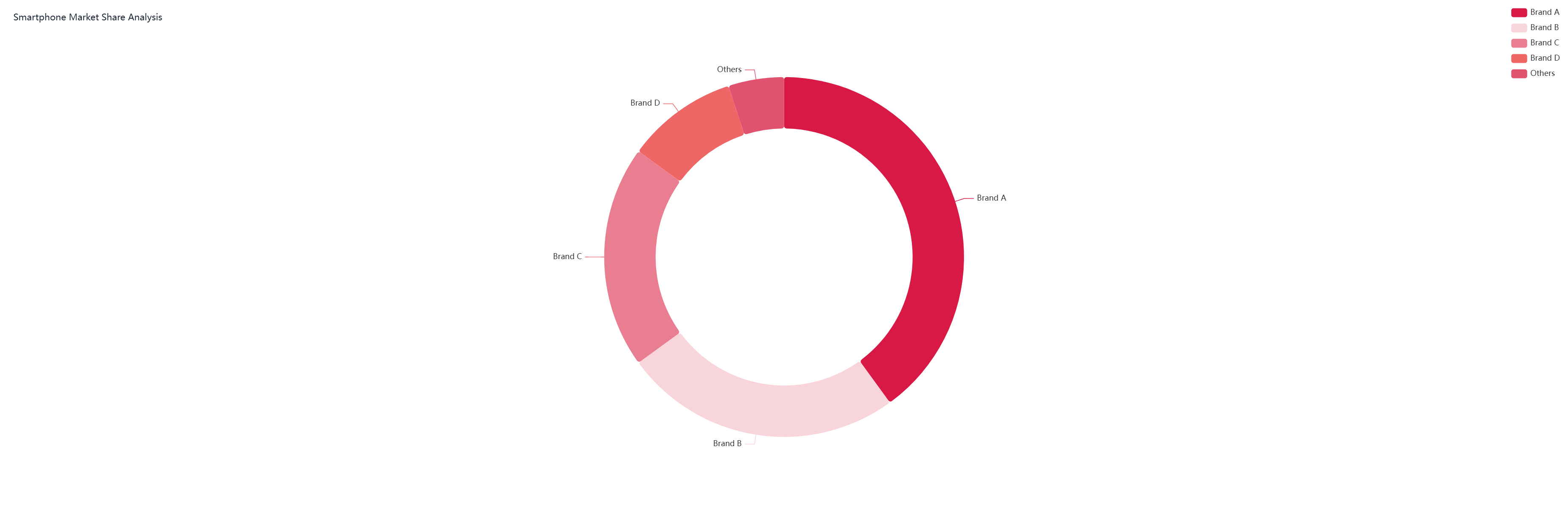
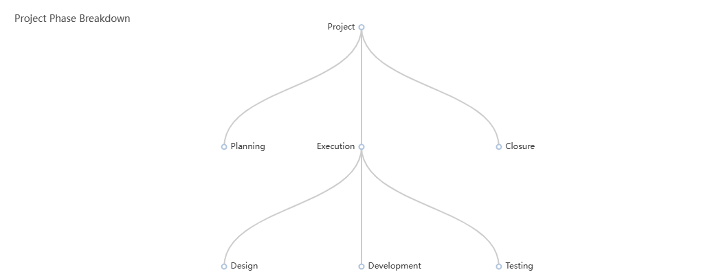
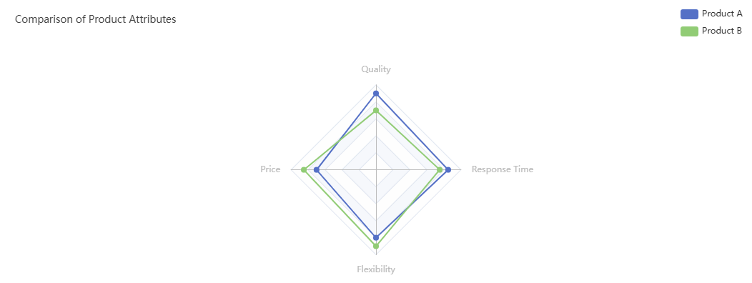
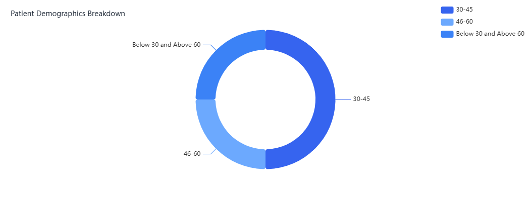
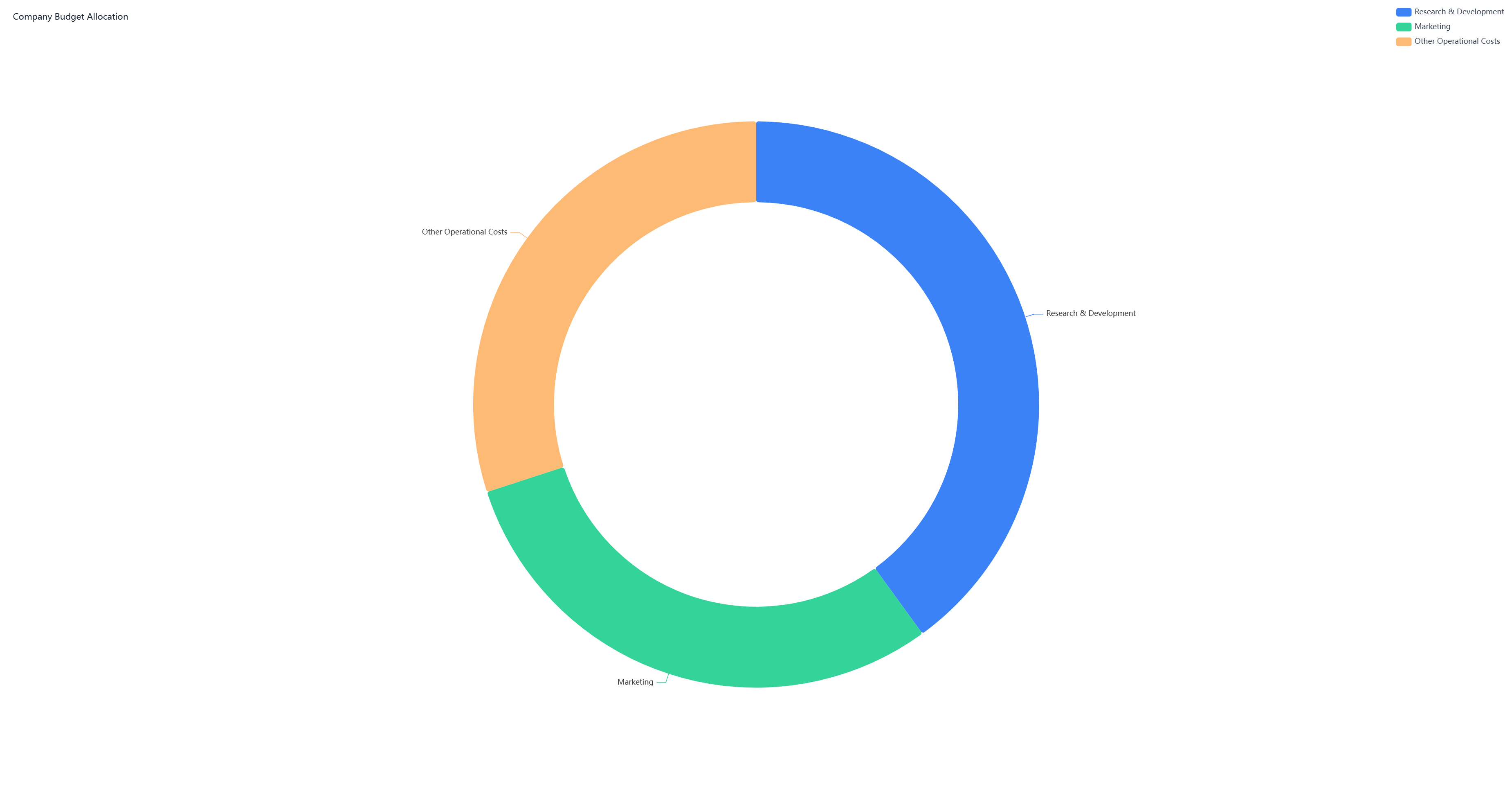
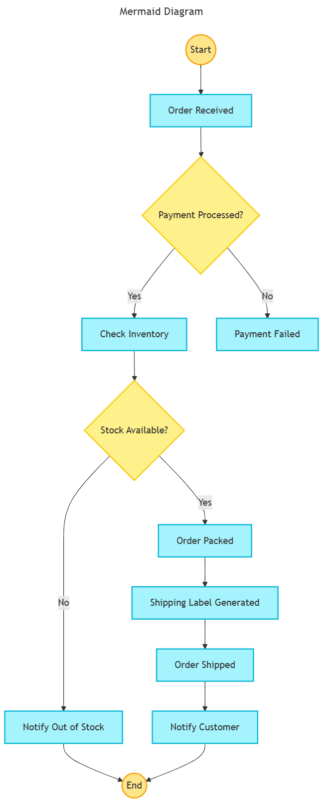
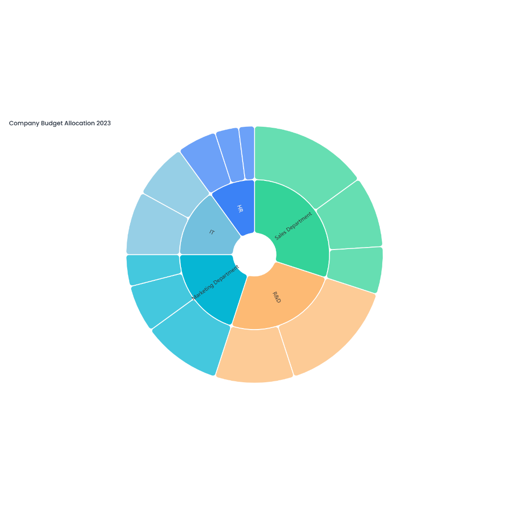
Description
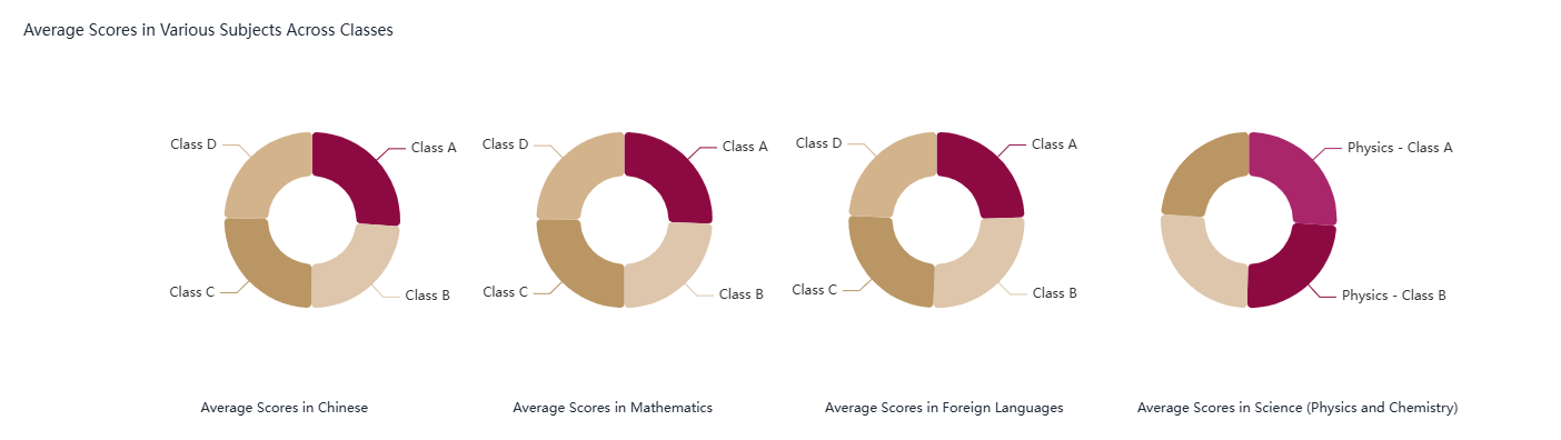
The doughnut chart for class grade distribution offers a clear and concise visual representation of how grades are spread across a class. The chart is designed as a doughnut - shaped ring divided into several segments, each corresponding to a specific grade category. Common grade categories include A, B, C, D, and F, though sometimes additional categories like "Pass" and "Fail" may also be used. The size of each segment is proportional to the percentage of students who achieved that particular grade. For example, if 30% of the students received an A, the segment for grade A will take up 30% of the doughnut ring. Each segment is color - coded and labeled with the grade category and its corresponding percentage to enhance clarity.
Interpretation and Applications
This chart provides teachers and educational administrators with valuable insights into the overall performance of a class. By examining the size of each segment, they can quickly assess which grades are most common. A larger segment for higher grades like A and B may indicate that the majority of students are performing well, while a significant segment for lower grades like D and F could signal areas where students are struggling and may need additional support.
The doughnut chart also helps in comparing grade distributions across different classes or subjects. For instance, if the chart for a mathematics class shows a higher percentage of lower grades compared to a literature class, it might suggest that students find mathematics more challenging and that teaching strategies or resources for the subject may need to be adjusted.
Furthermore, this visual tool is beneficial for reporting and communication purposes. Teachers can include it in parent - teacher meetings or in class performance reports to visually convey the class's academic standing. It simplifies the process of explaining complex data in an easily understandable format, making it an effective addition to educational assessments and evaluations.