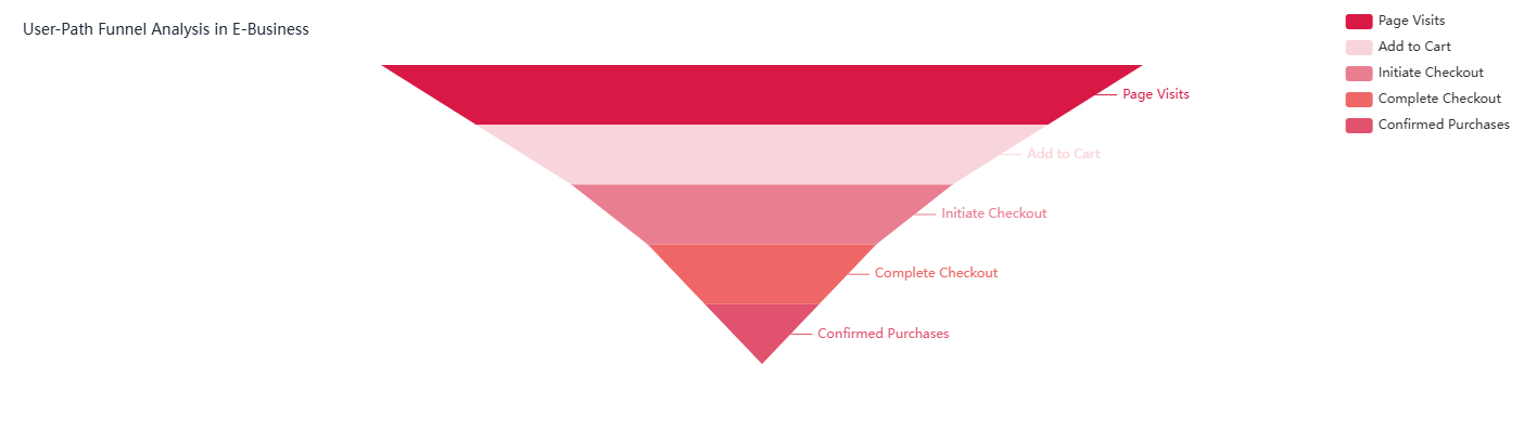
Description
Structure
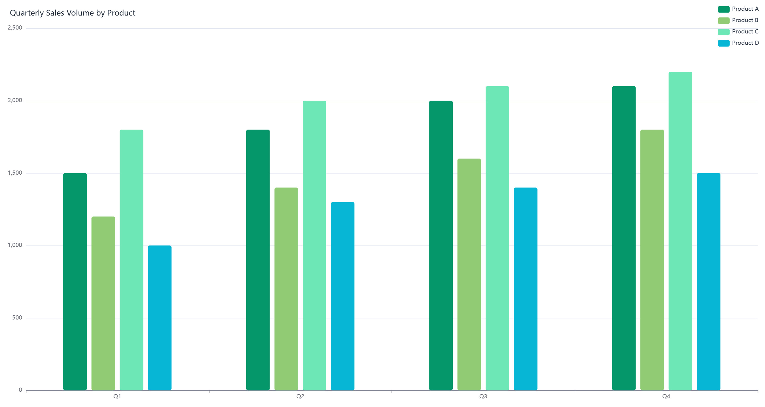
The line chart displaying website traffic from different marketing channels is a dynamic visual tool that shows traffic trends over a specific period. Multiple lines, each representing a distinct marketing channel such as organic search, paid search, social media, email marketing, and referral sites, are plotted on the chart. The horizontal axis typically represents time, divided into intervals like days, weeks, or months, while the vertical axis indicates the number of visitors or traffic volume. Data points are marked at regular intervals for each channel and connected by lines, forming a visual timeline of traffic fluctuations.
Interpretation and Applications
This chart offers valuable insights into the effectiveness of various marketing channels. By observing the trends, businesses can identify which channels consistently drive the most traffic. For example, a steadily rising line for organic search suggests successful SEO efforts, while a spike in the social media line might indicate the impact of a recent campaign or viral content.
The chart also helps in comparing channels. A channel with a higher line throughout the period is a more significant traffic source. Additionally, it can reveal seasonal patterns or the effects of specific marketing initiatives. For instance, a sudden increase in paid search traffic following a new ad campaign can be easily observed.
Moreover, this visual tool assists in resource allocation. Channels showing strong, consistent growth may deserve increased investment, while underperforming ones might need strategy adjustments. It enables businesses to make data-driven decisions to optimize their marketing mix and improve overall website traffic and conversion rates.