Description
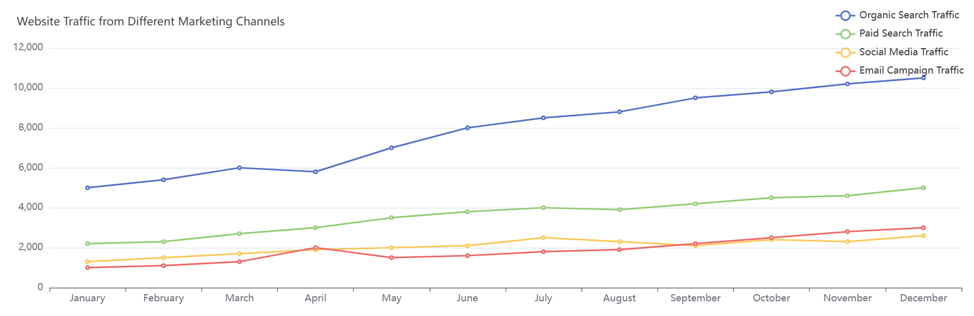
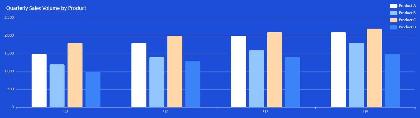
This visualization tracks sales performance across products over four quarters, highlighting trends and growth patterns. Each product’s bars or lines represent quarterly sales figures, enabling comparisons of consistency and seasonality. For example, Product A may show steady growth, while Product B peaks in Q3 due to seasonal demand. Key insights include identifying top performers (e.g., Product C dominating Q4), underperforming items, and opportunities for inventory adjustment or marketing campaigns. This data aids in strategic planning, resource allocation, and forecasting for future periods.