Description
Structure
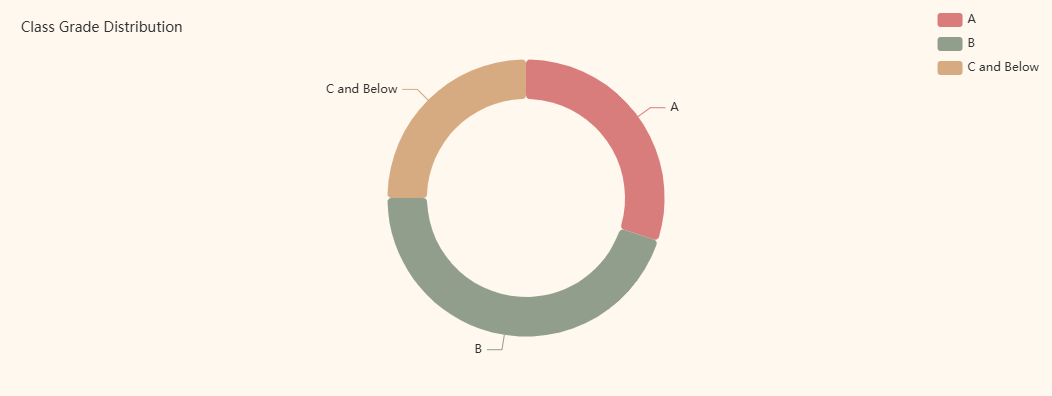
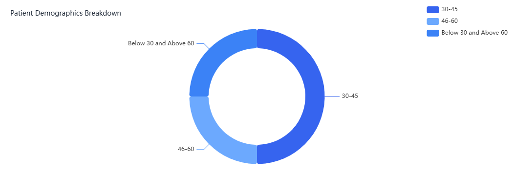
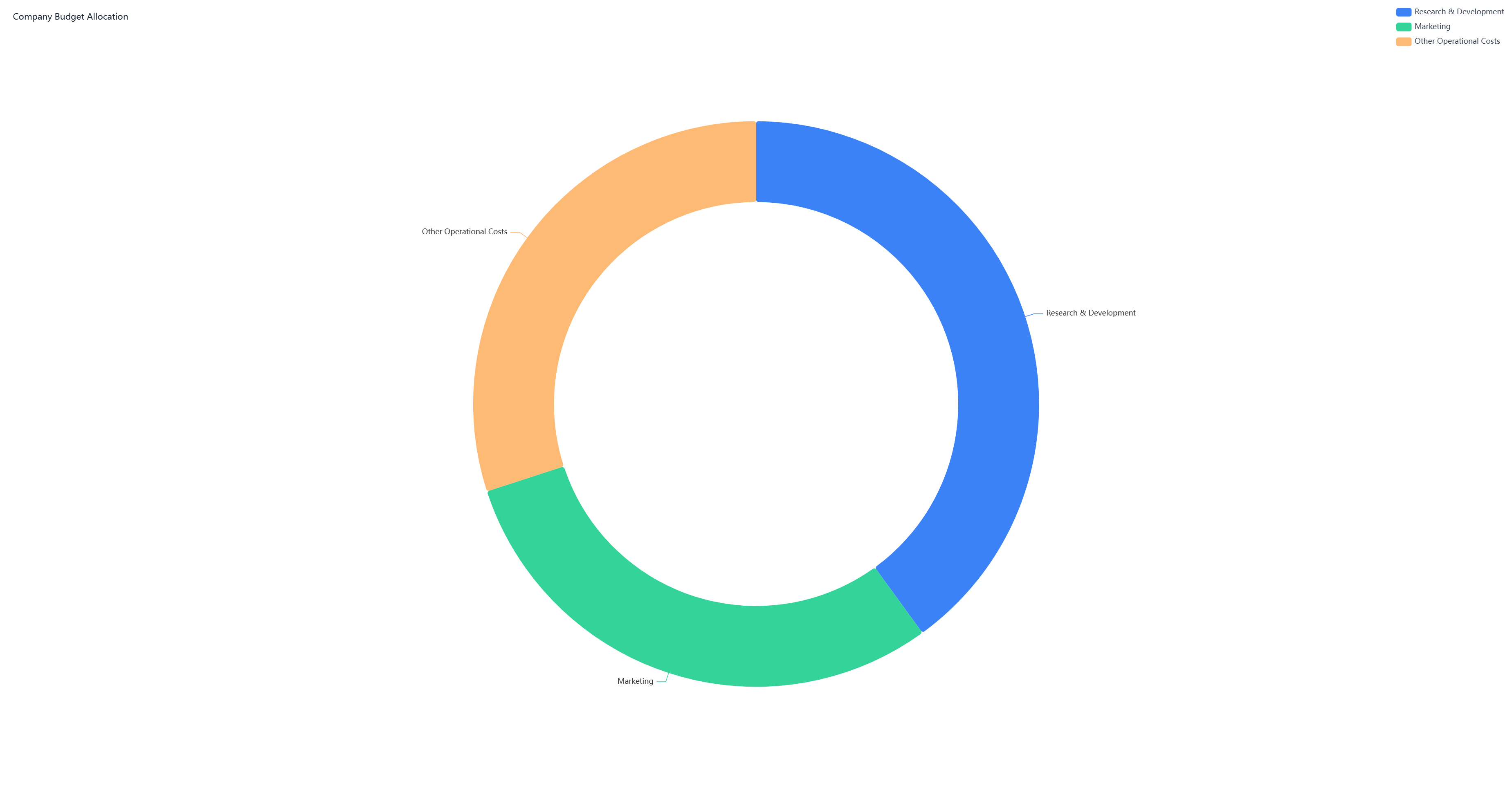
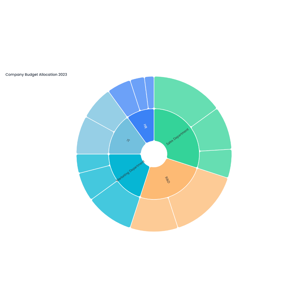
The doughnut chart for smartphone market share analysis is a visual representation that illustrates the distribution of market share among different smartphone brands. The chart is designed as a doughnut-shaped ring divided into several segments, with each segment corresponding to a specific smartphone brand. The size of each segment is proportional to the brand's share of the market, based on factors such as unit sales, revenue, or market penetration. For example, if Brand A holds 30% of the market share, its segment will take up 30% of the doughnut ring. Each segment is color-coded and labeled with the brand name and its corresponding market share percentage to enhance clarity.
Interpretation and Applications
This chart provides valuable insights for industry analysts, marketers, and business strategists. By examining the size of each segment, stakeholders can quickly identify which brands dominate the market and which ones hold smaller shares. A larger segment for a particular brand may indicate its strong market position, popularity, or effective marketing and product strategies. Conversely, smaller segments may represent emerging brands or those facing challenges in gaining market traction.
The doughnut chart also facilitates comparisons between brands and helps track changes in market share over time. For instance, if a brand's segment increases in over size successive quarters, it suggests successful growth and increased consumer adoption. Additionally, the chart can highlight opportunities for new entrants or areas where existing brands may need to innovate or adjust their strategies to compete more effectively.
In summary, the doughnut chart for smartphone market share analysis is a useful tool for visualizing and understanding the competitive landscape of the smartphone industry. It helps stakeholders make informed decisions, develop targeted marketing strategies, and respond to market dynamics effectively.