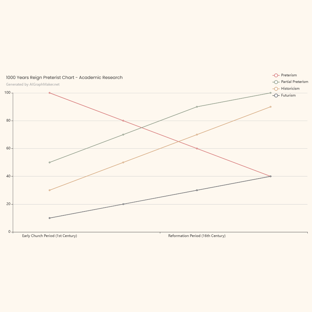
The data provided is in percentage form. To create a graph, we need to convert these percentages into a suitable format for visualization, such as a bar graph or line graph. A line graph is suitable to show trends over time. Each location will have its own line.
The x-axis of the graph will represent the dates (7/12/04, 7/13/05, etc.), and the y-axis will represent the percentage of bears observed at each location.
Plot the data points for each location on the graph. For example, on 7/12/04, Chinitna Bay had 33.77%, North Tuxedni Bay had 15.58%, and so on. Connect the points for each location to form a line.
Bear habitat selection is influenced by several factors including food availability (salmon runs, berries), access to water, denning sites, and human disturbance. The variations in bear distribution across locations likely reflect differences in the availability and quality of these resources. For example, a higher concentration of bears in Chinitna Bay on certain dates might indicate a significant salmon run or abundant berry patches in that area during those times.
Analyzing the graph reveals trends in bear populations by location. For example, Chinitna Bay shows a fluctuating pattern, with peaks in bear presence at certain times. This suggests that resource availability in Chinitna Bay is not consistent throughout the year. Other locations show different patterns, reflecting their unique resource dynamics.